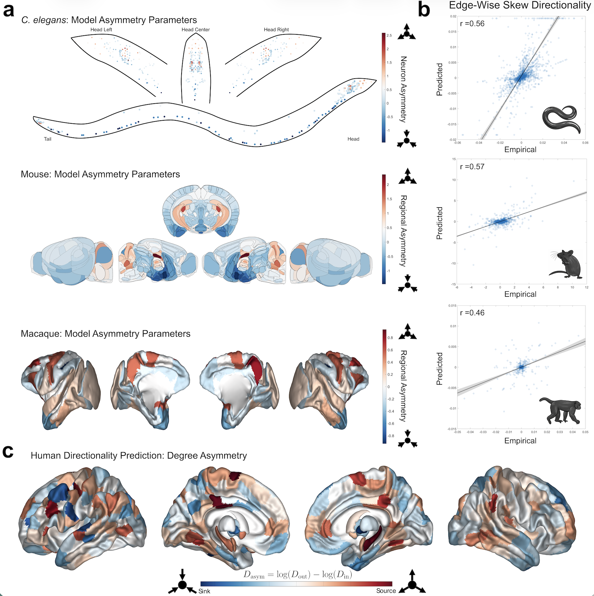
 Figure 1. (a) Model-estimated directionality parameters (e^{Ga}) for the three non-human species: C. elegans (top), Mouse (middle), Macaque (bottom). In the C. elegans plot, each dot represents a single neuron. (b) Scatter plots comparing empirical to predicted skew edges with Pearson correlations listed at the top left (all p<10^{-37}). (c) Predicted human overall degree asymmetry for 414 brain regions.

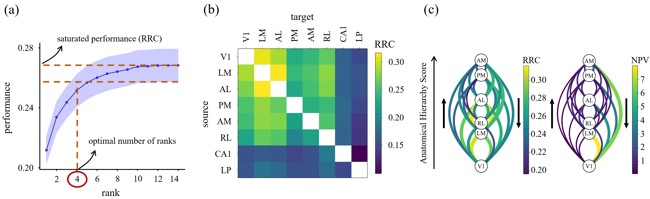 Figure 1. Low-dimensional communication subspaces define RRC. (a) Prediction performance vs. rank; saturation defines optimal number of ranks and RRC. (b) Average RRC across animals; cortical areas are more predictable than subc

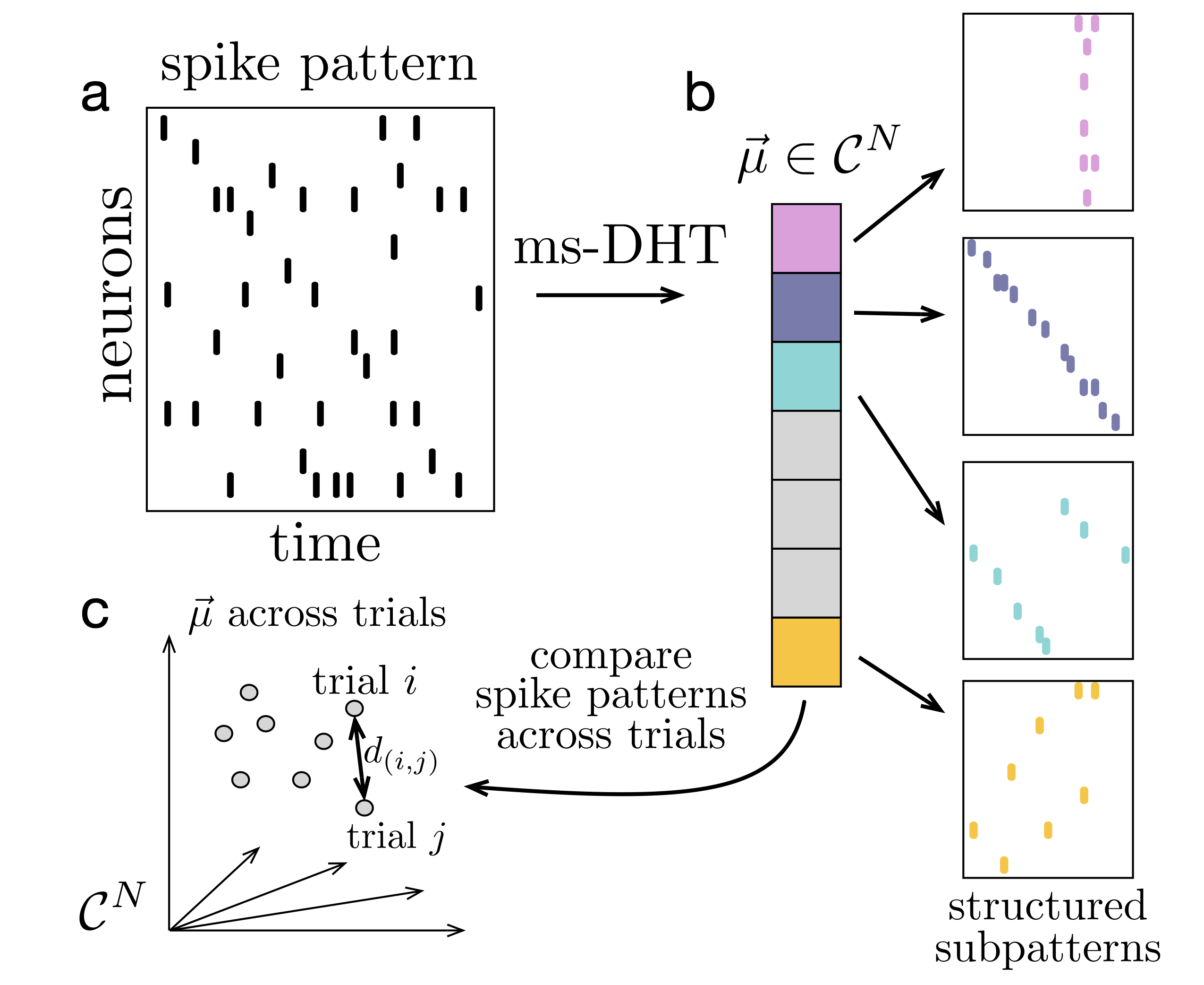 FIgure 1. Decomposing spike patterns. The ms-DHT maps a spike pattern (a) to a unique complex-valued vector (b). Each component encodes the strength (amplitude) and timing (phase) of a basis sub-pattern. (c) Distances between spike patterns reduce to Euclidean distances between ms-DHT outputs, which are invariant to neuron order, ensuring behaviourally relevant clusters do not depend on neuron order.
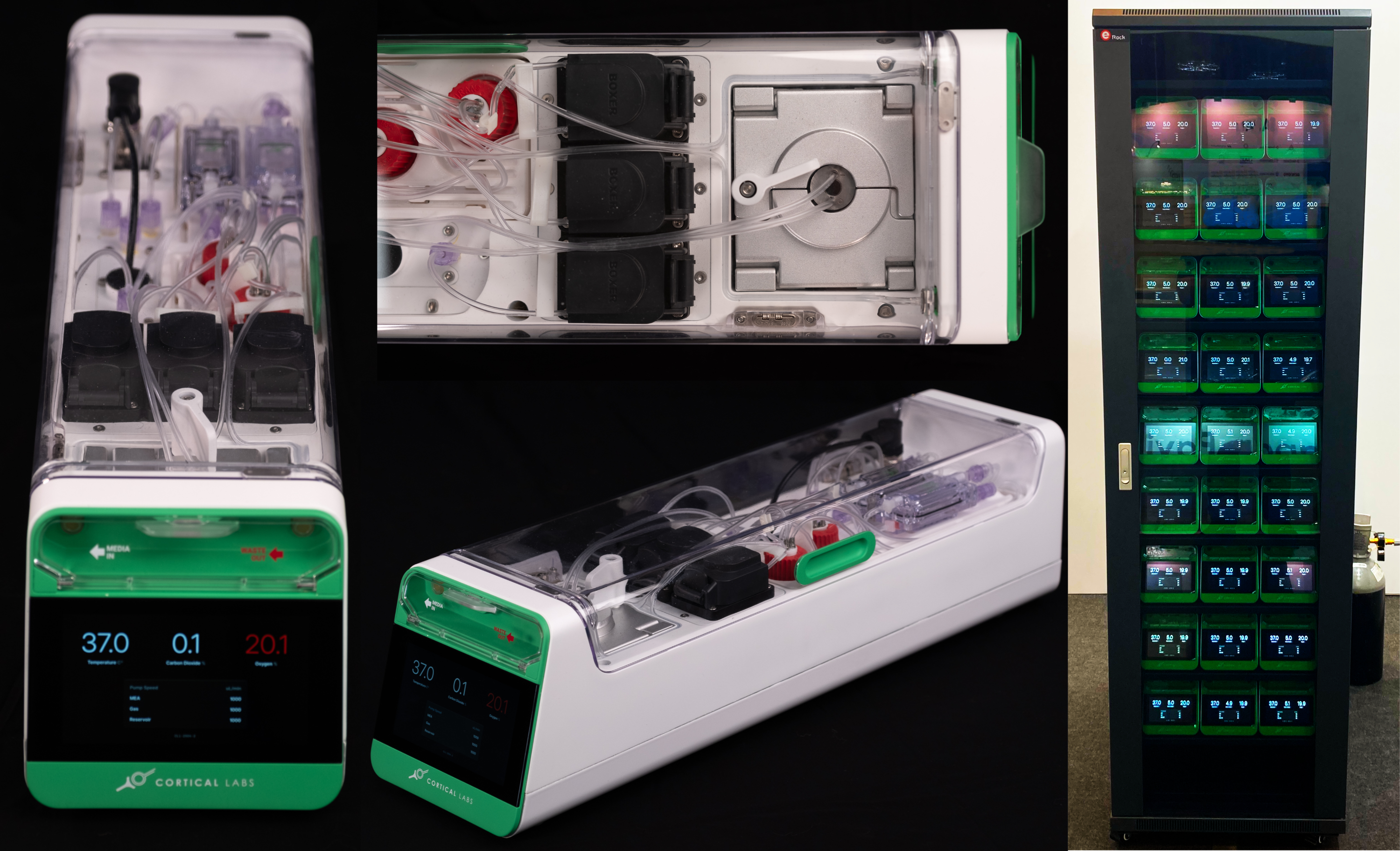 Figure 1. The CL-1 device is scalable desktop device compatible with standard server racks that allows real-time closed-loop interactions with neural cells via an MEA reader. The CL-1 has onboard hardware that interprets simple code via a Python API to allow rapid code development and experimental iterations coupled with a closed-loop perfusion circuit to automatically adjusts gas levels and temperature to
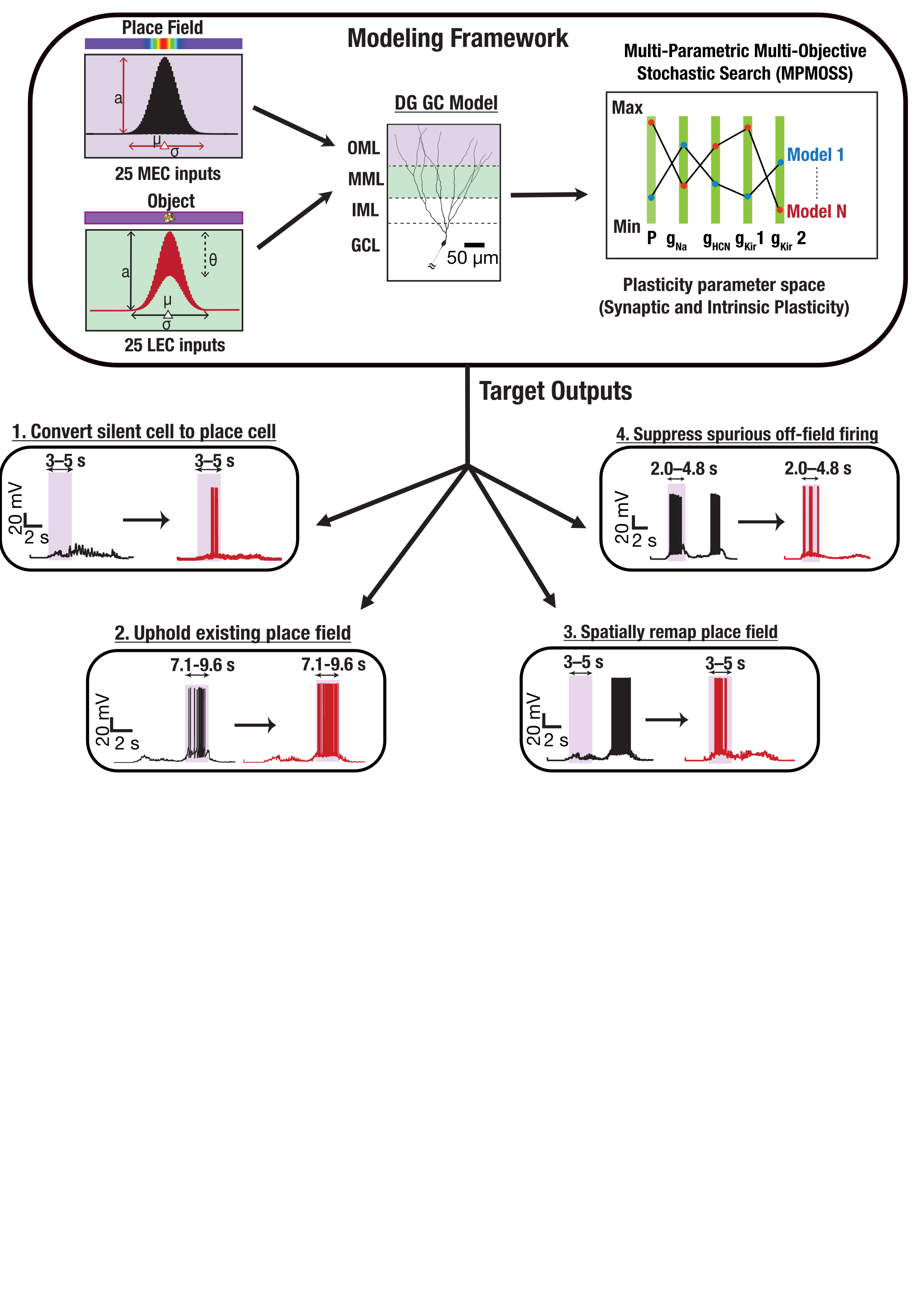 FIgure 1. Medial and lateral entorhinal cortex inputs impinge on a DG granule cell. Disparate combinations of synaptic and intrinsic plasticity (NaP, HCN, Kir channels) achieved one of four targets: convert silent cell to place cell, uphold existing place field, remap, or suppress spurious firing. Our results show that robust and flexible spatial tuning is achievable through plasticity degeneracy.References


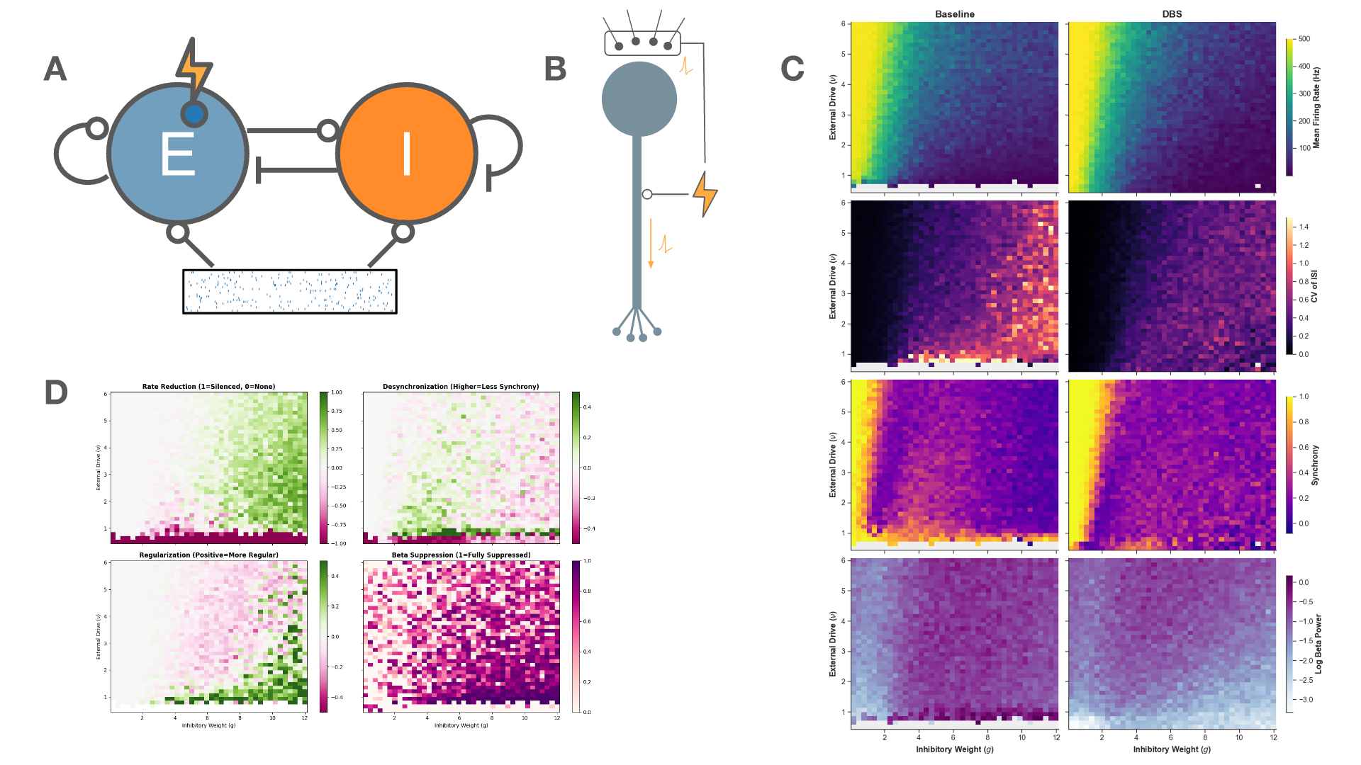 Figure 1. A: Schematic of the network architecture. A subset of the excitatory population is the target of stimulation. B: Schematic of the stimulation model. C: The firing rate, regularity, synchrony, and beta-band power across the parameter space for baseline (left) and 130 Hz stimulation (right). D: The effect of stimulation on metrics of therapeutic efficacy
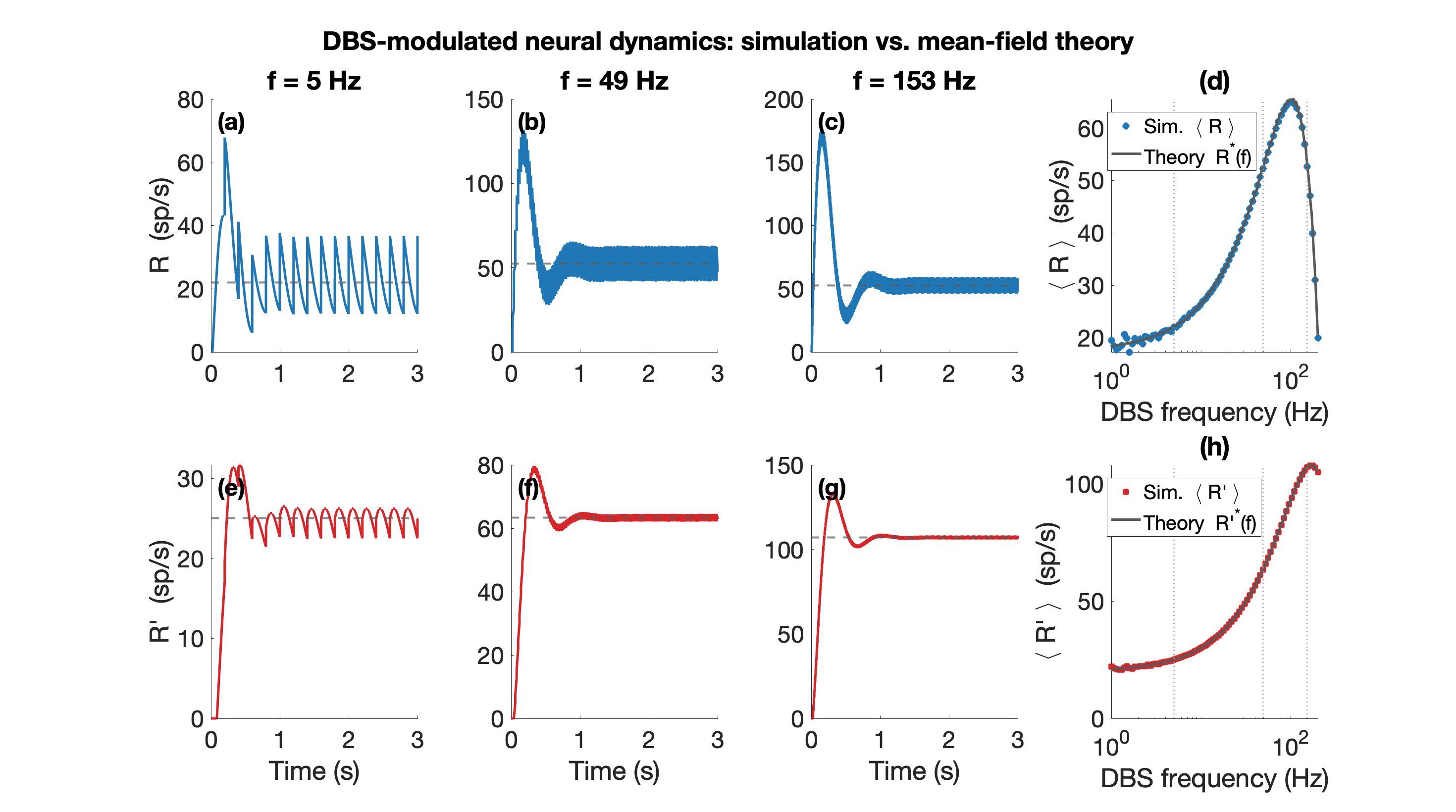 Figure 1. Mean-field theory vs. simulation (N=100 per population). (a)-(c) Excitatory rate R(t) over 0-3 s at f=5, 49, 153 Hz (blue); grey dashed: mean-field prediction; rate fluctuates around mean. (e)-(g) Inhibitory rate R'(t) (red), same convention. (d) Mean R and (h) mean R' at steady state vs. DBS frequency (log scale); circles: simulation; grey line: theory.
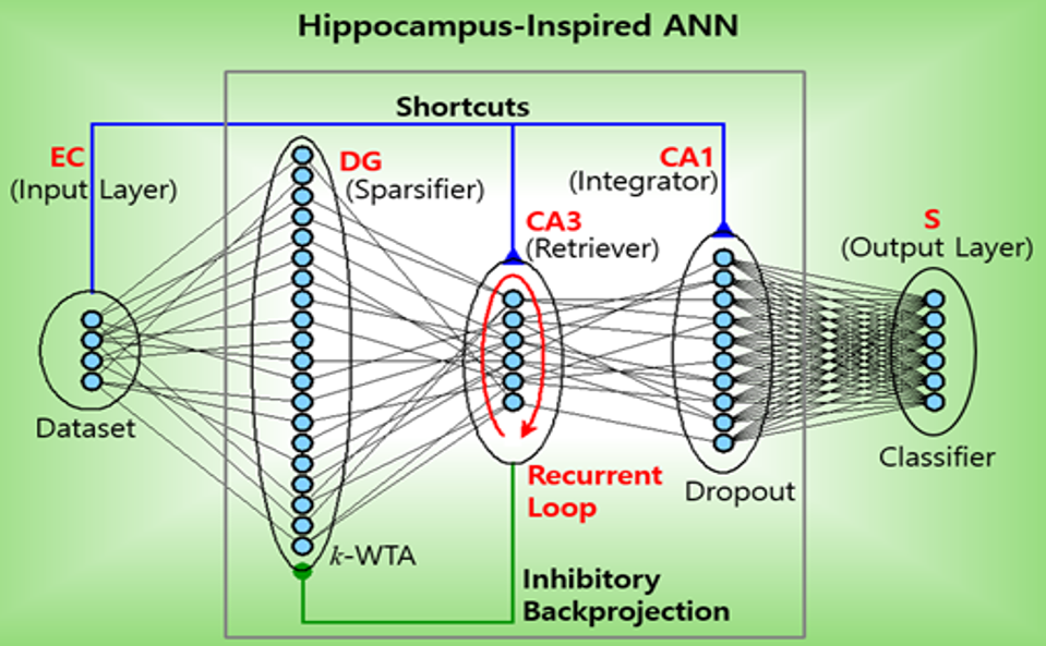 Figure 1. Hippocampus-inspired artificial neural network (ANN). Feedforward: EC (entorhinal cortex) → DG (dentate gyrus) → CA3 and Shortcuts (SCs): EC → CA3 and EC → CA1 and inhibitory backprojection: CA3 → DG. S: subiculum.References
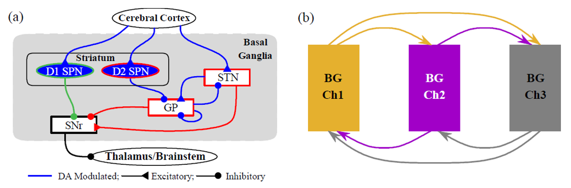 Figure 1. (a) Single-channel BG circuit. Green and red lines represent direct pathway (DP) and indirect pathway (IP) to the output nucleus, SNr, respectively. (b) Three-channel BG SNN. Channels 1-3 represent actions and are shown in orange, purple, and gray, respectively.References
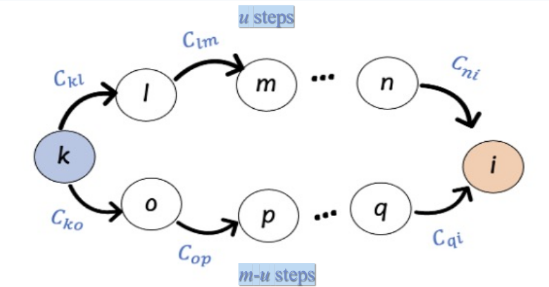 Figure 1. Deviation from stability D_st corresponds to a weighted count of convergent walks on the network C
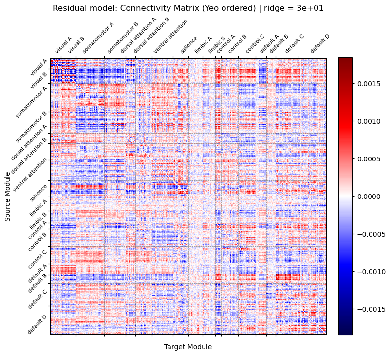 Figure 1. Connectivity matrix estimated from residual model using ridge regression (λ = 30.0) and reordered by Yeo 17 functional networks. The value at row i and column j represents the predictive weight from source node i to target node j. Red: positive predictive weights. Blue: negative predictive weights.
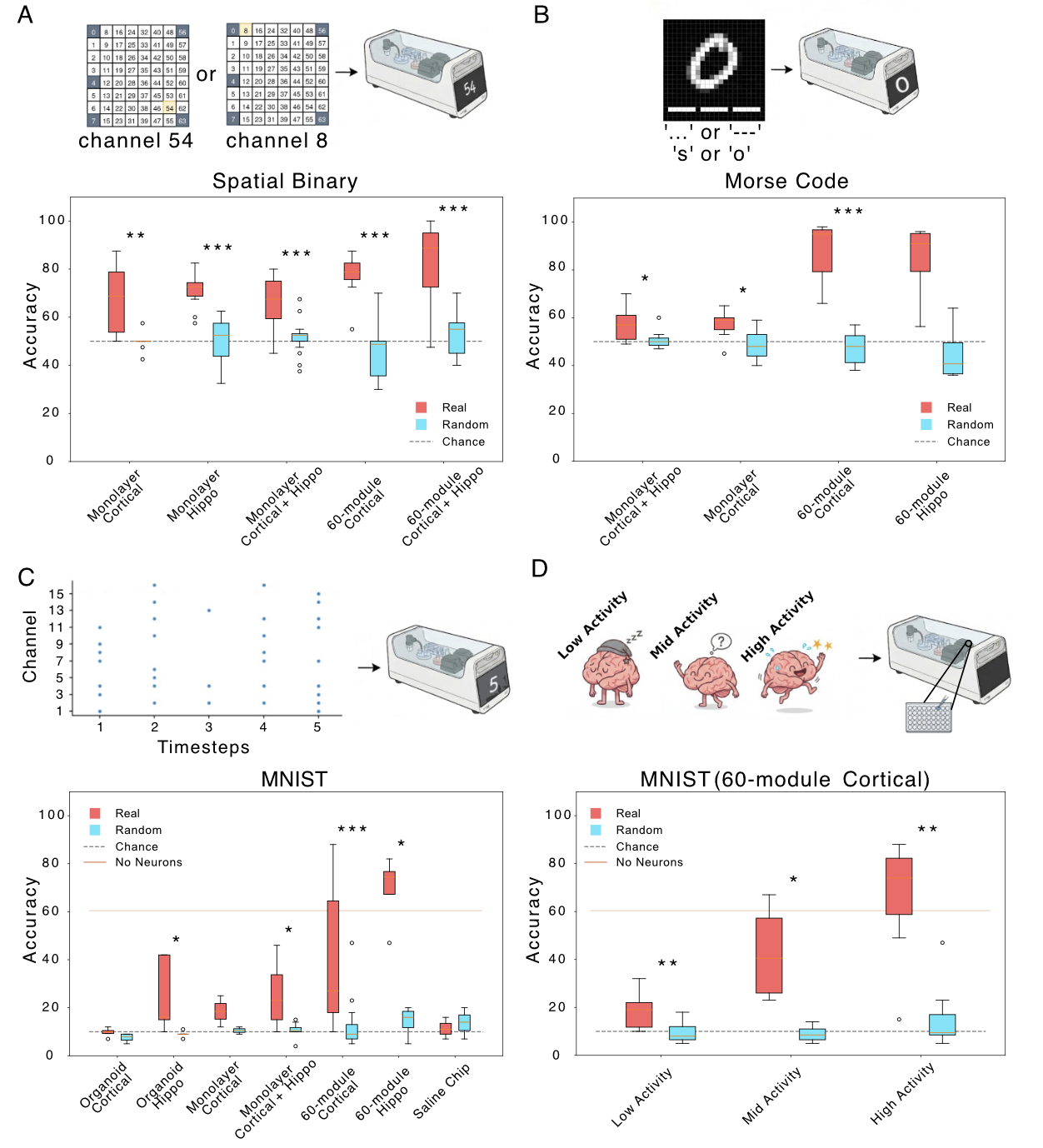 Figure 1. Binary classification (all distances). Red: neuronal cultures; cyan: shuffled controls. (B) Morse code: accuracy for letter prediction; X-axis cell type/activity; dark green real, light green shuffled. (C) MNIST: digit-prediction accuracy; same axes/colors; dashed line chance. (D) Cortical 60-module MNIST accuracy vs activity (low/med/high). *p<0.05, **p<0.01, ***p<0.001.
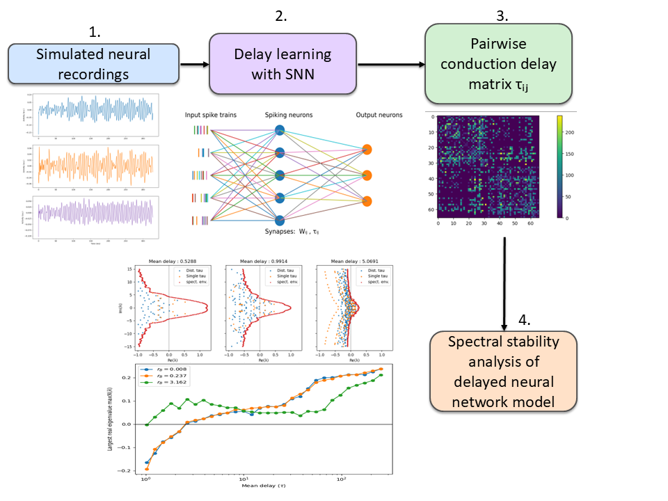 Figure 1. Pipeline for data-driven inference of conduction delays and stability analysis of delayed neural networks. Simulated neural recordings are used to train a spiking neural network that infers a pairwise delay matrix τ. The learned delays are incorporated into delayed neural network models whose spectral properties and stability are analyzed.
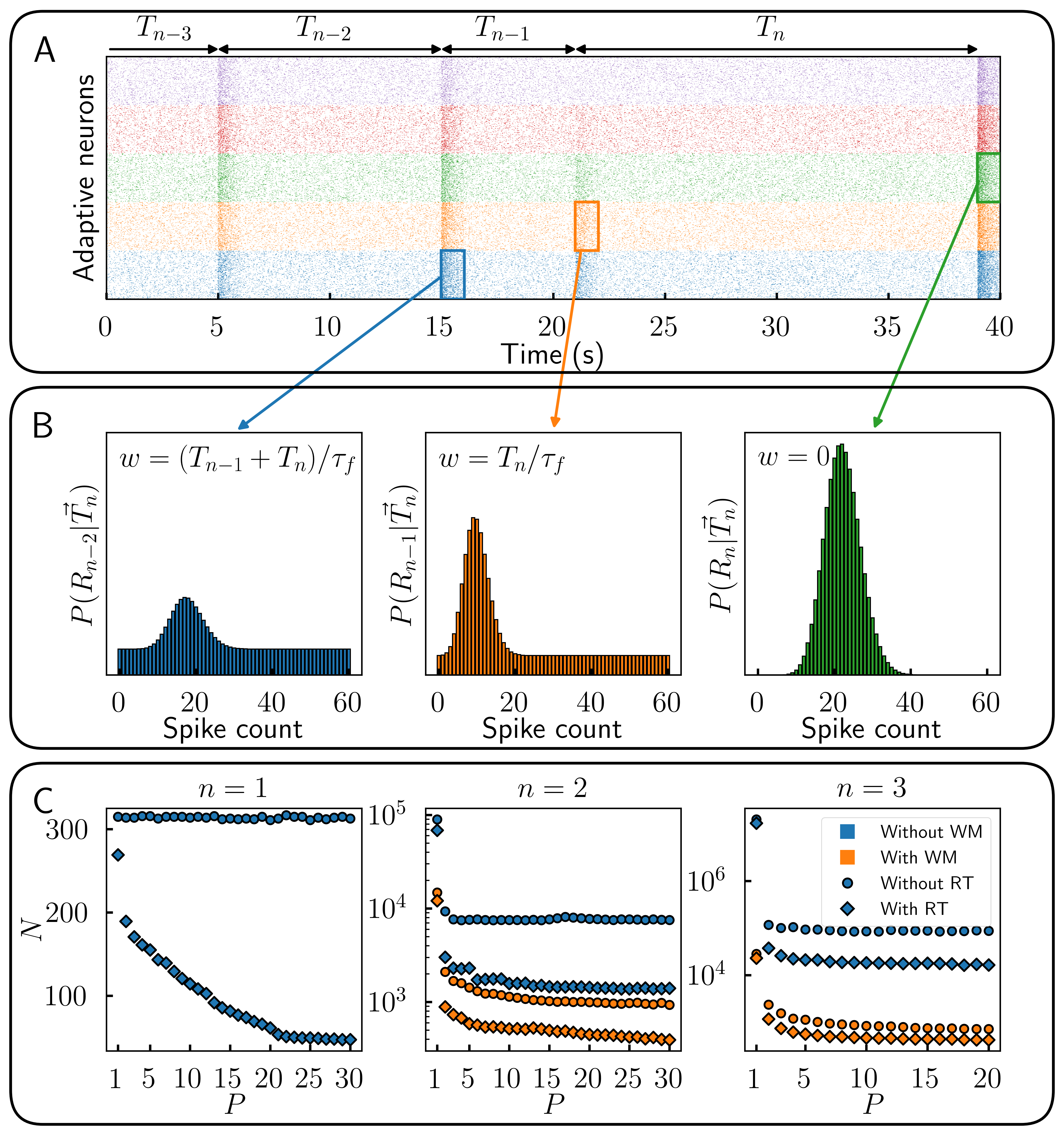 Figure 1. Encoding time sequences is more efficient with parametric heterogeneity. (A) Responses of multiple populations of adaptive cells with response threshold. (B) Recollection of past responses (working memory) during event n. (C) Number of cells N necessary to reach 80% of theoretical maximum information content about a sequence of length n for different number of optimized populations P.
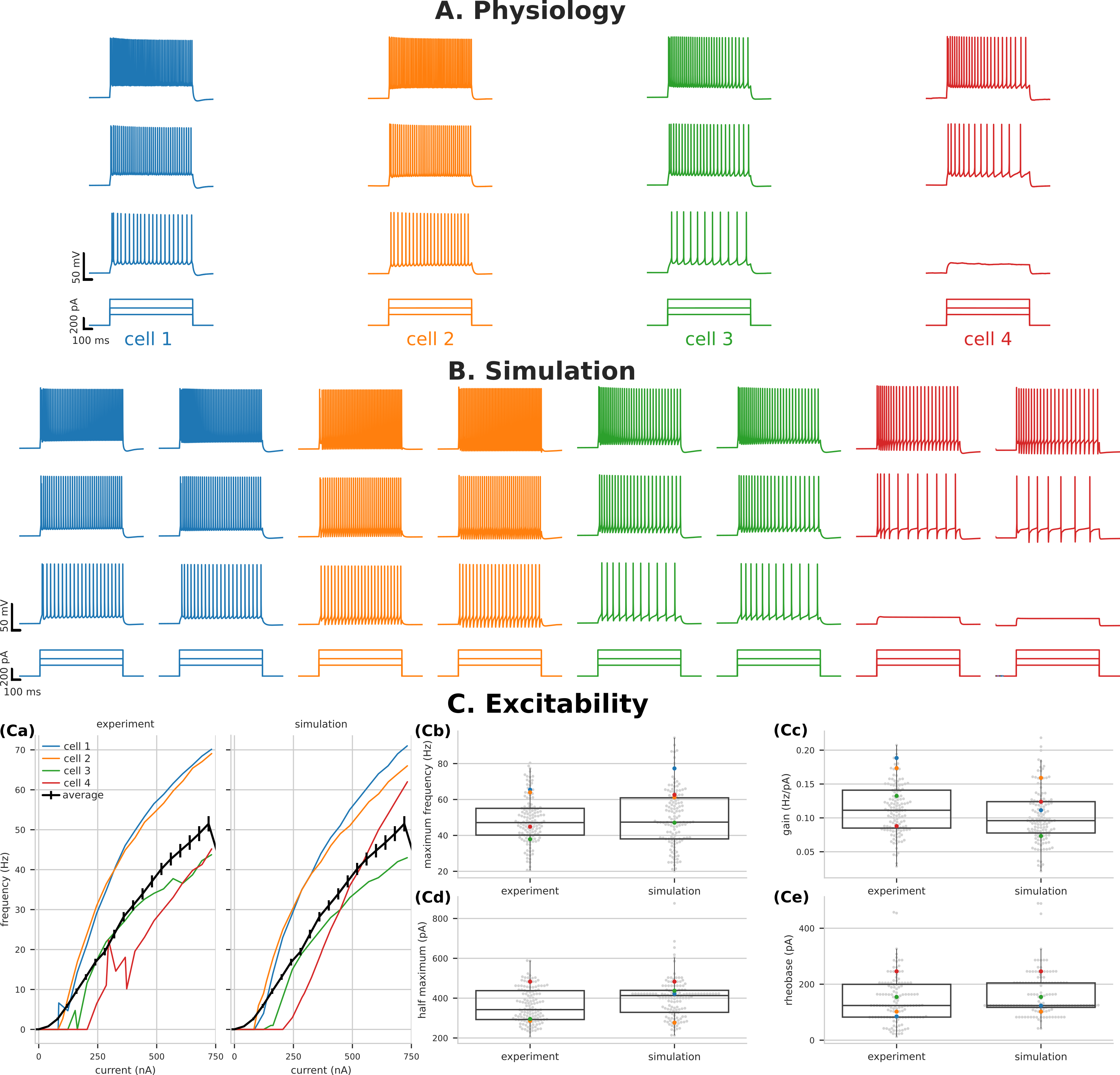 Figure 1. Variability of PT5B excitability captured by parameter optimization. Voltage traces of PT5B neurons to current clamp at (160 pA, 320 pA, and 480 pA) (A) Experiments, (B) Simulation. (C) Excitability measures demonstrate the variability seen between cells and the ability of parameter optimization to capture both individual responses (highlighted) and the population distribution.
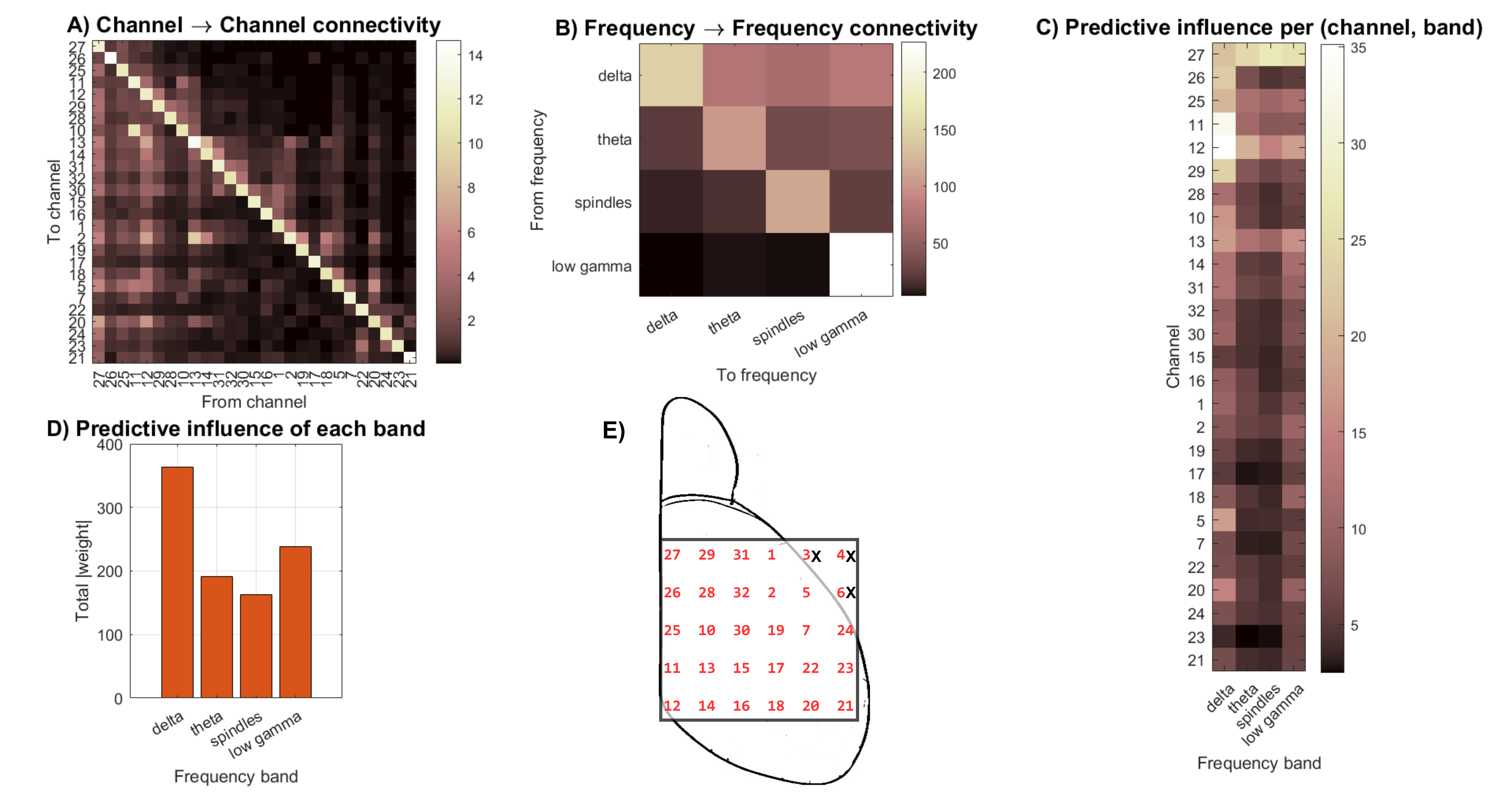 Figure 1. A) Cross-channel interactions summed over all frequency bands. B) Cross-frequency interactions summed over all channels. C) Summed band activation per channel. D) Frequency band predictive influence in future states. E) Illustration of the mouse dorsal portion of the cortex with the 32-electrode ECoG grid.
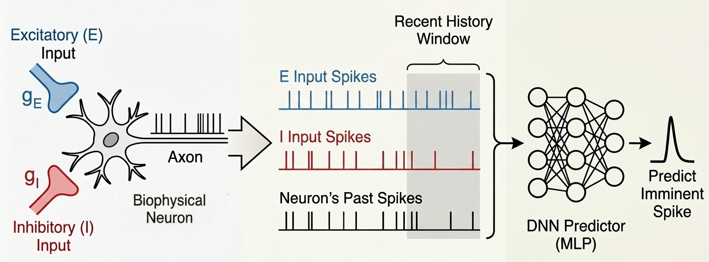 Figure 1. Schematic overview of the spike prediction pipeline. A biophysical neuron model receives balanced excitatory and inhibitory synaptic inputs. The recent temporal history of these inputs, along with the neuron’s own past output spikes, is extracted and fed into a deep neural network (DNN) to predict imminent spikes.
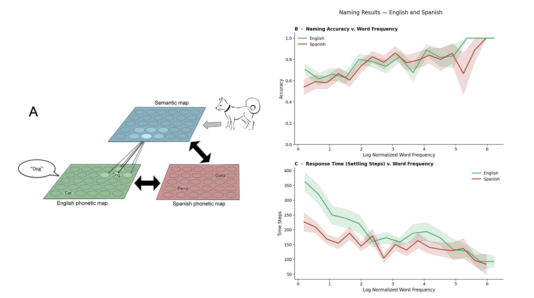 Figure 1. Left: BiLex model with lateral connections, adapted from [1]. Naming is simulated by presenting an input to the semantic map, propagating activation through bidirectional associative connections, and producing a response from a phonetic map, in English and Spanish. Right: accuracy significantly increased with word frequency (p < 0.001) while response times were significantly faster (p < 0.001).
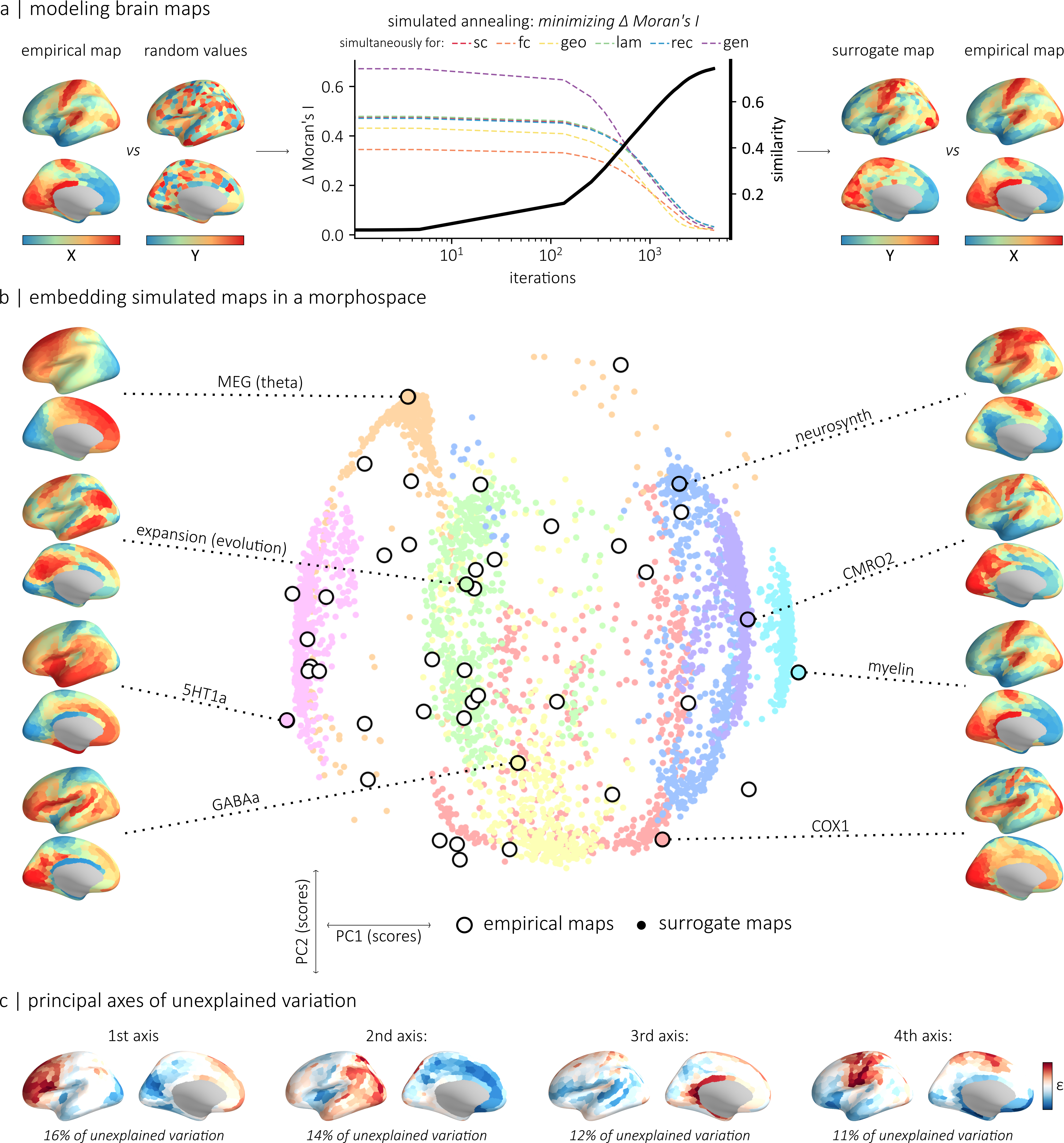 Figure 1. (a) The generative model relies on simulated annealing to randomly permute values while minimizing the difference in autocorrelation between empirical and simulated maps. (b) Morphospace summarizing the topographic properties of the empirical and simulated maps. (c) We identified the four main axes of variance in a matrix of regional difference between simulated and empirical values.References
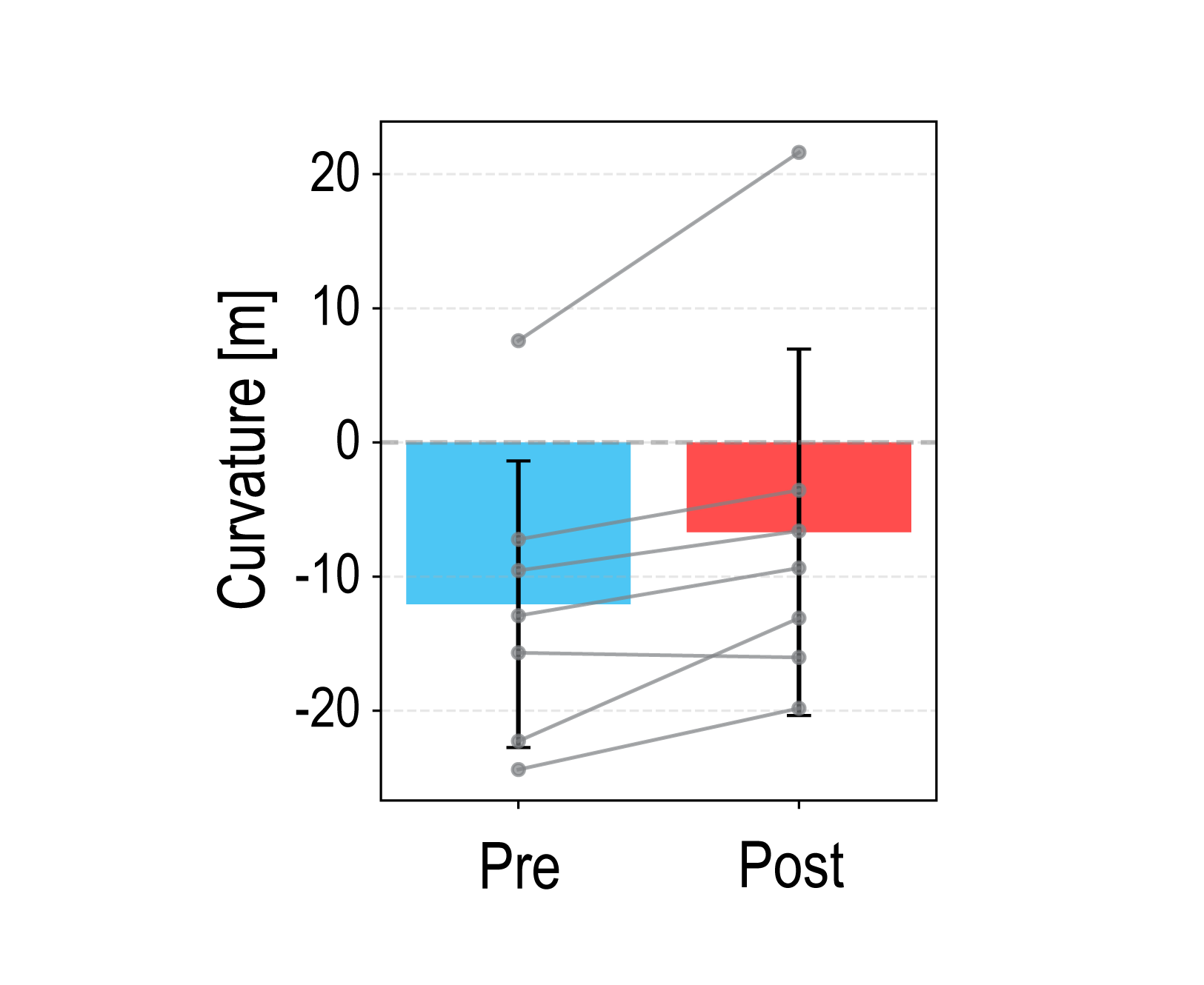 Figure 1. Mean PSE curvature across participants in pre- and post-adaptation curvature discrimination tests. Error bars represent the standard deviation. Positive and negative values indicate an upward- and downward-convex curves, respectively. Gray dots represent individual participant data.
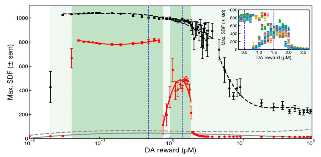 Figure 1. Learning performance as a function of dopamine reward concentration. Mean SDF peak responses during post-training testing are shown for the original Izhikevich model (black dashed line) and the modified model (red solid line), averaged over (N = 11) simulations; error bars indicate SEM. Gray curves represent responses to non-rewarded stimuli. Green shading marks regions with AUC ≥ 0.9.
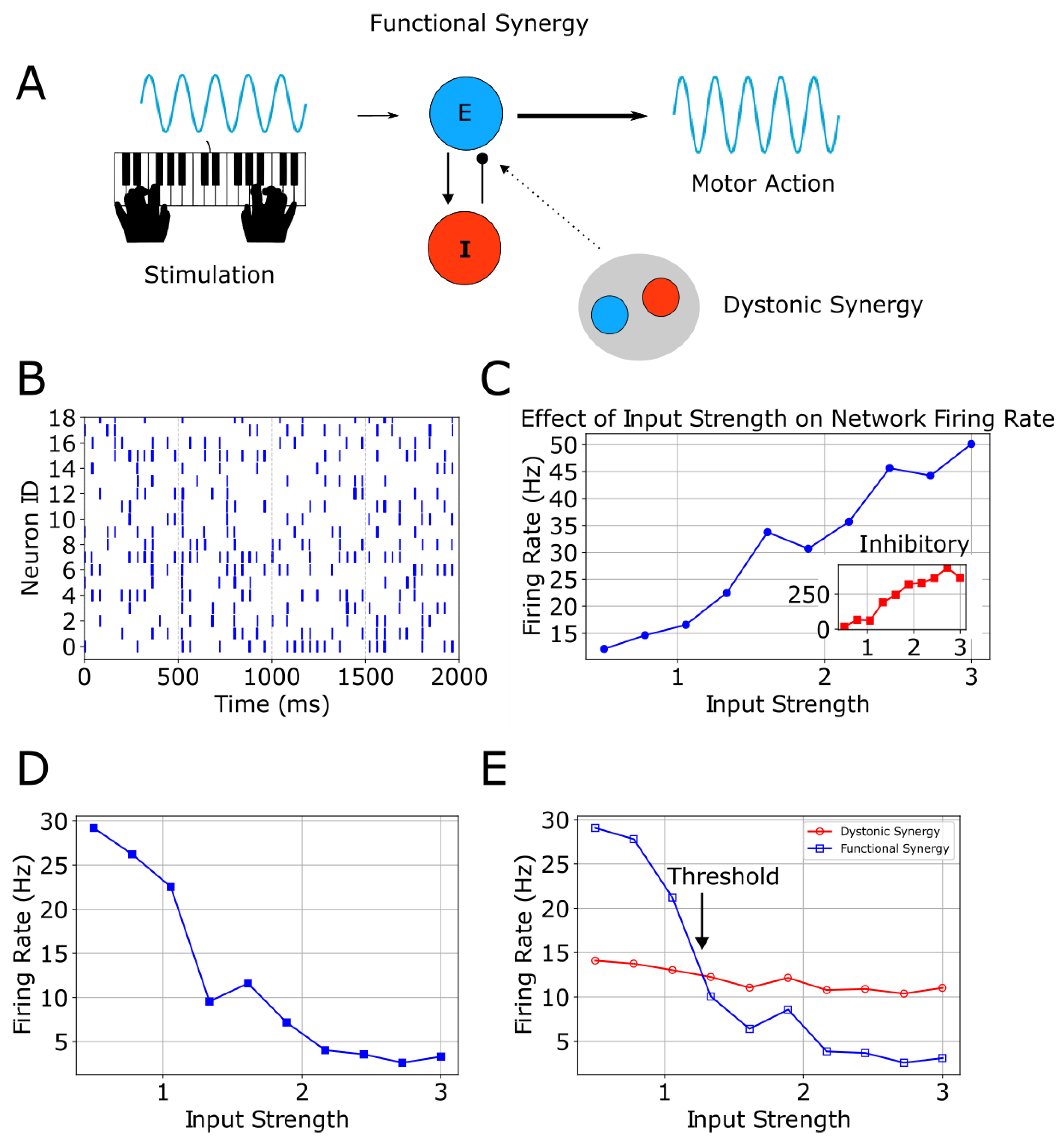 Figure 1. A, stimulation evokes motor action via functional excitatory/inhibitory synergy, with optional overlapping dystonic synergy. B, healthy-state raster shows regular spikes across neurons. C, firing rate increases with input strength; inset shows inhibitory activity. D, altered E/I balance produces a decreasing response. E, dystonic and functional firing diverge at a threshold across input levels.
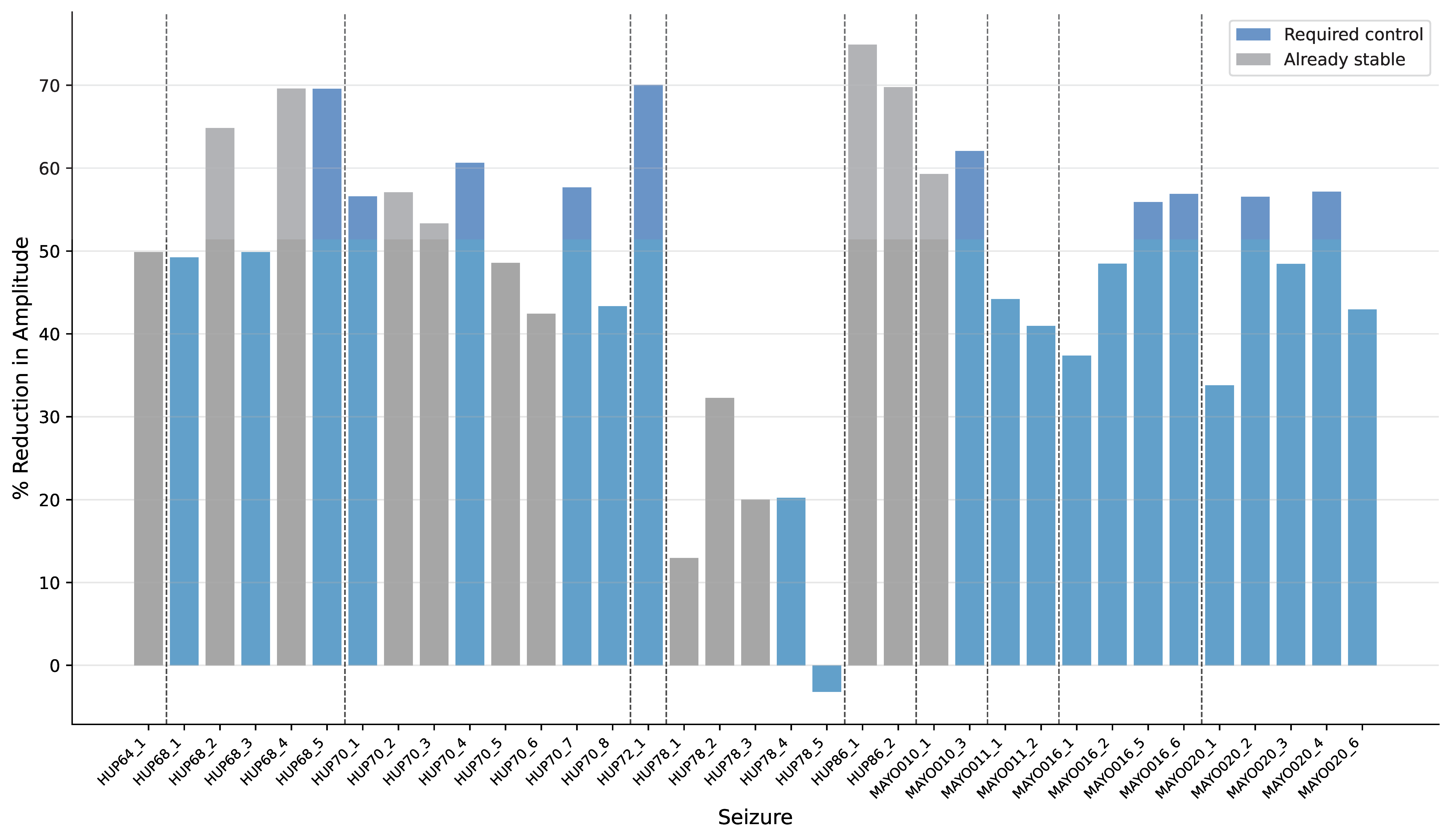 Figure 1. Percentage amplitude reduction for each seizure. Gray bars represent seizures that are already stable (maximum eigenvalues < 1), while blue bars indicate seizures that require stabilization. Vertical dashed lines separate patients. Only 1 seizure increased in amplitude after control. Control reduced amplitude by an average of 48.96% + 16.94%.