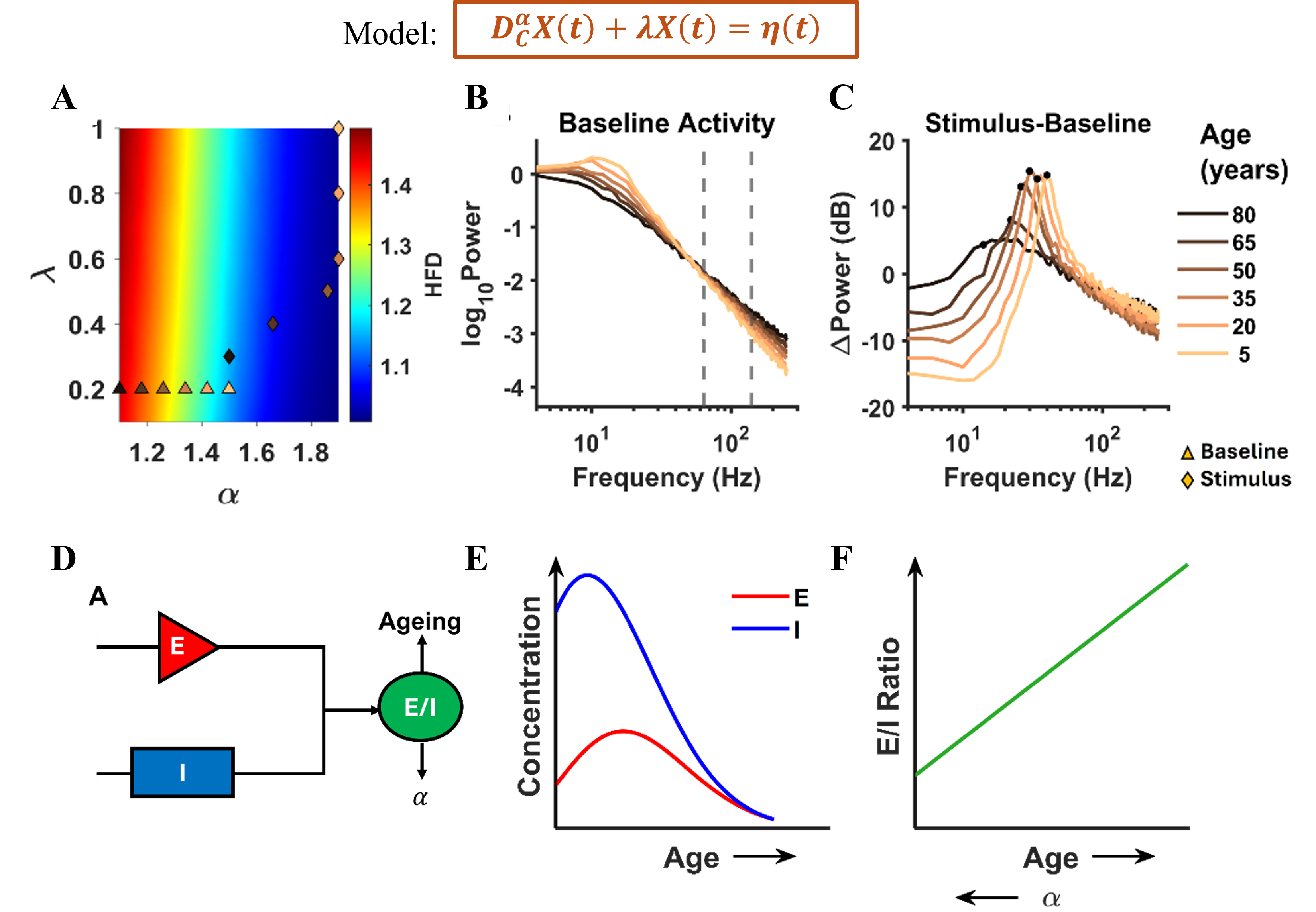
 Figure 1. Age-related inferences: Top: Model equation. (A) HFD variation with α and λ. (B), (C) The PSDs and ΔPower (in dB) corresponding to triangles and diamonds respectively. (D) Illustration of E/I dependence on ageing and α. (E) The concentration of excitatory and inhibitory neurotransmitters varying non-monotonically with age. (F) Corresponding monotonic E/I ratio with age and α.
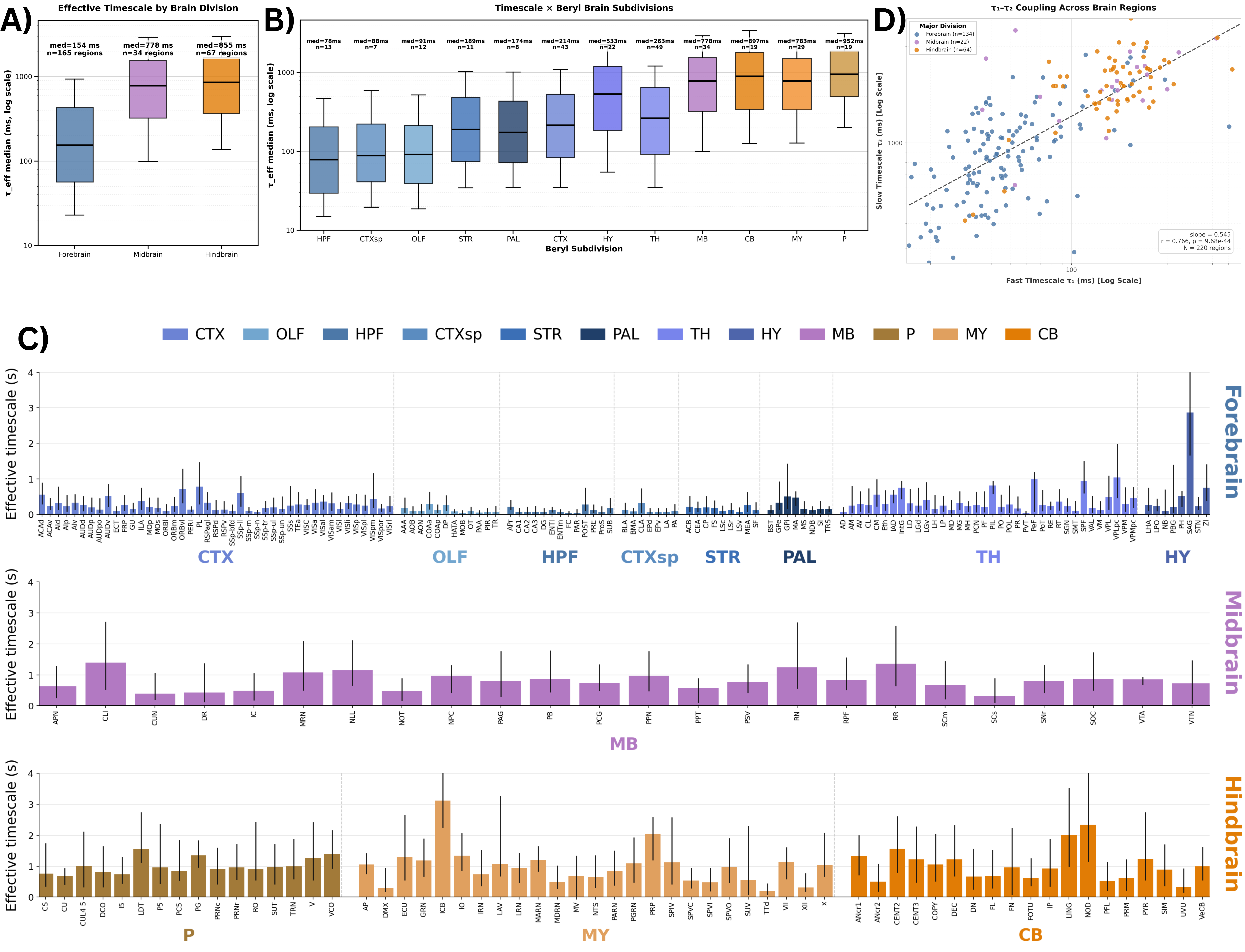 Brain-wide map of intrinsic neural timescales. (A) τ_eff by major brain division. (B) τ_eff across 12 brain subdivisions. (C) Median τ_eff per region; error bars show 10th–90th percentiles. Regions grouped by division, ordered alphabetically; colors denote subdivision. (D) Fast (τ₁) vs slow (τ₂) timescales across regions.
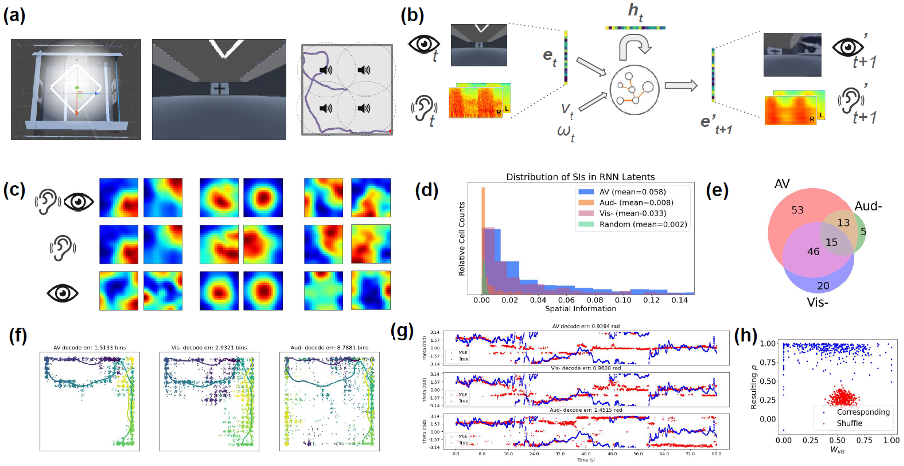 (a) Virtual environment with visual cues and sound sources; (b) Model architecture and pipeline; (c) Spatial ratemap examples in audiovisual, and lesioned (-) conditions; (d) Distribution of spatial information contents; (e) Number of place units identified; (f) ML decoding of position; (g) ML decoding of head direction; (h) Distribution of visual weights (x) and resulting correlations (y); compar
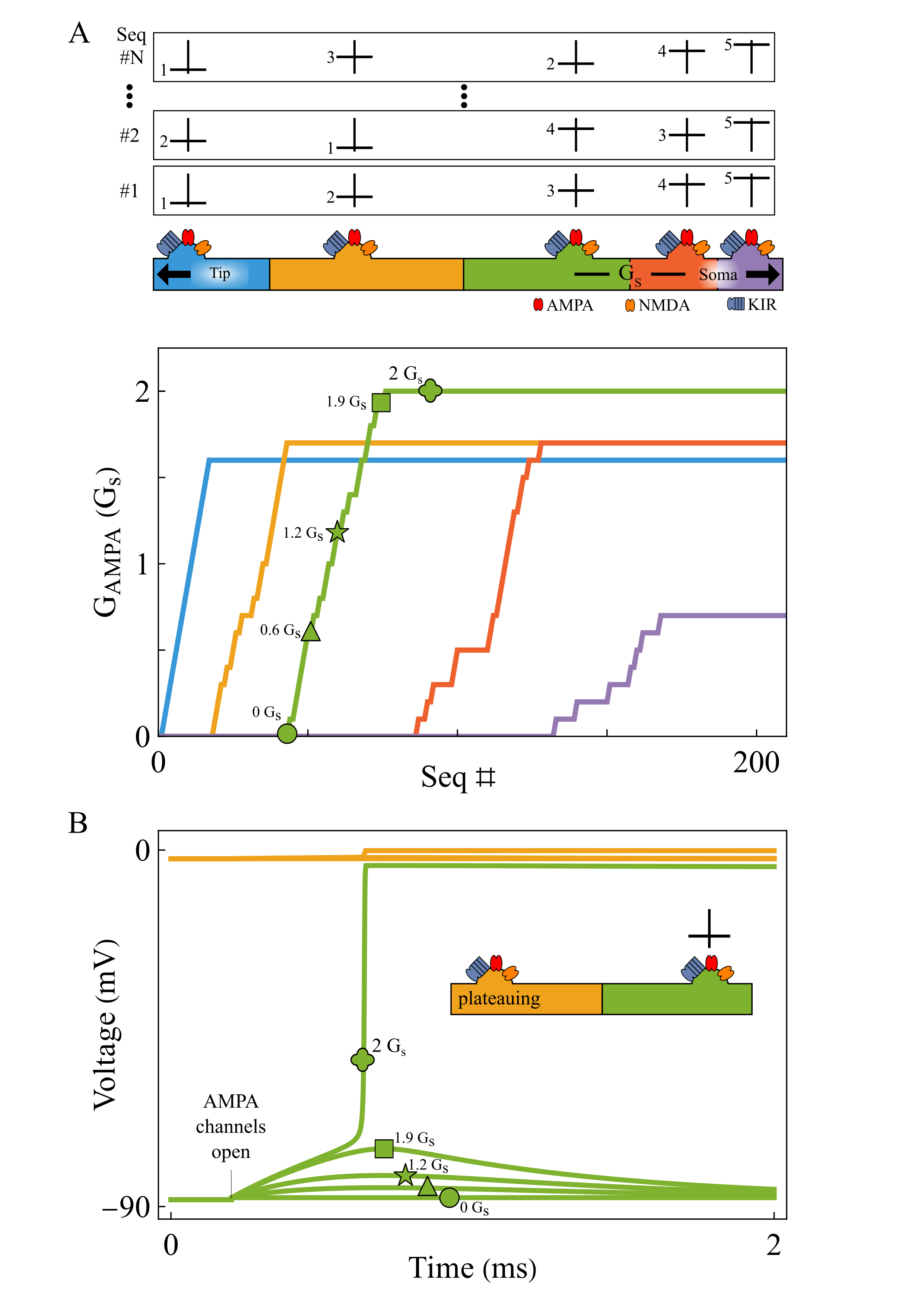 Local AMPA plasticity tunes dendritic sequence selectivity. Repeated tip-to-soma and shuffled inputs progressively strengthen AMPA conductance from tip to soma (A). When a segment (green) receives input while its tip-side neighbor is plateauing (yellow), weak AMPA initially fails to trigger a plateau. As AMPA increases, the segment abruptly transitions to plateau at a bifurcation (B).References
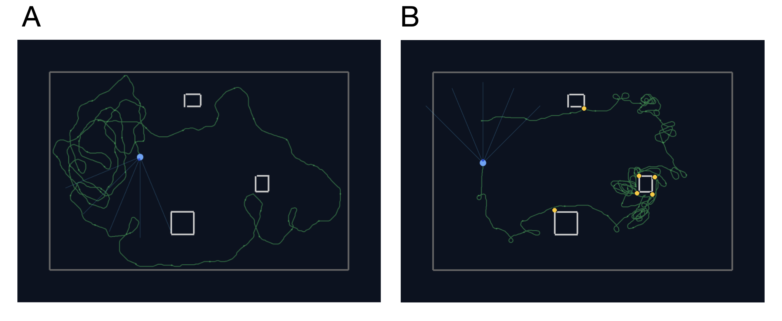 Example trajectories (green) of an agent (light blue circle with blue rays indicating visual sensors) in an arena with three high-contrast obstacles. A: The agent forages where no obstacles are present. It also frequents the part of the arena with obstacles, but never collides with them. B: Trajectory for an agent with less training times, leading to frequent collisions (yellow dots).References
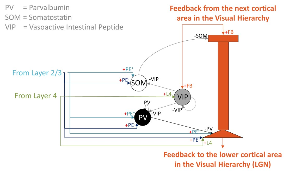 Layer 5 predictive-coding microcircuit. A two-compartment Layer 5 pyramidal neuron integrates somatic input from Layer 2/3 prediction-error populations (PE+ and PE-) and Layer 4 feature neurons with apical feedback from higher cortical areas. A local VIP-PV-SOM motif regulates apical Ca2+ spikes and burst output.
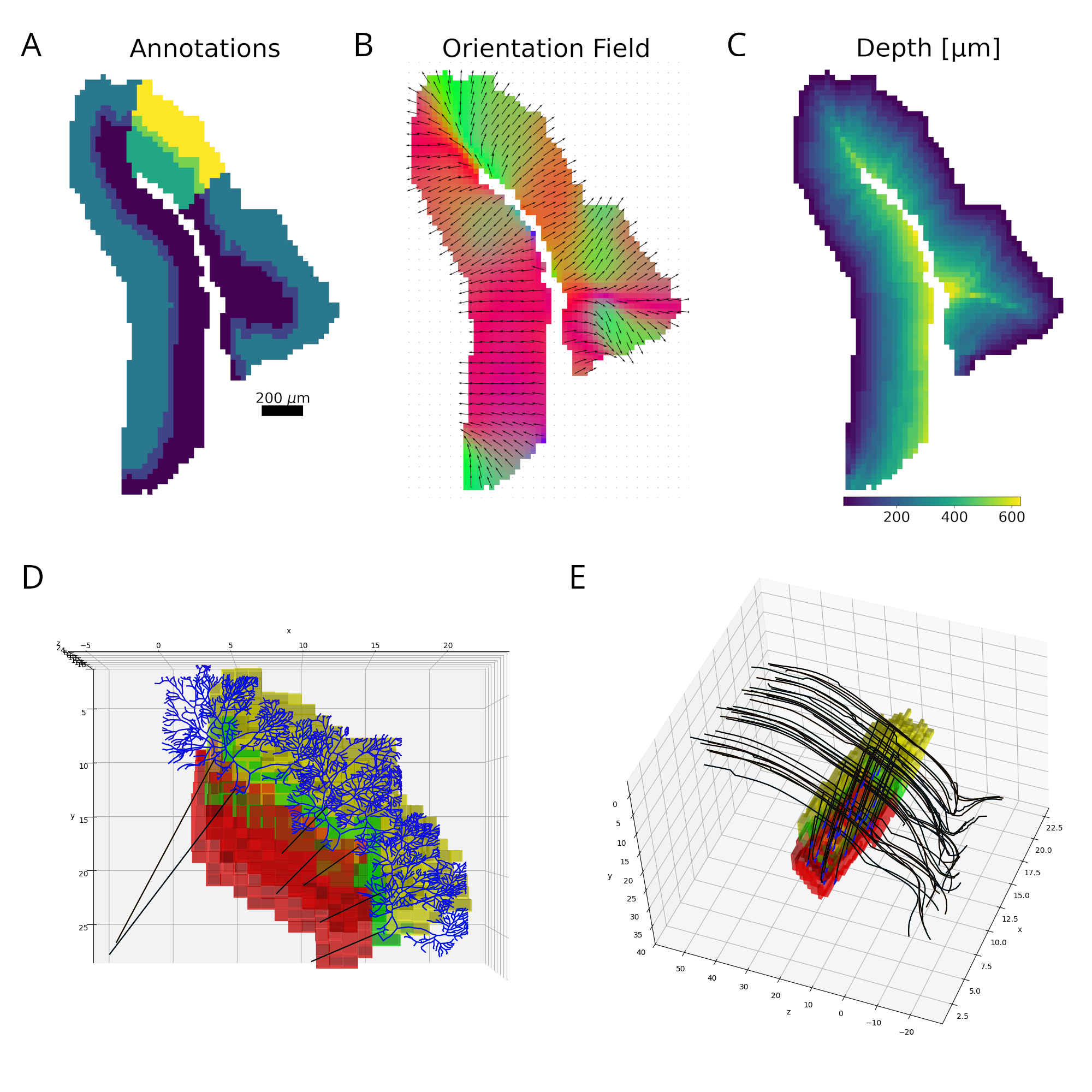 Figure 1. Reconstruction pipeline. A. Declive layers shown in colors with the selected column highlighted. B. Orientation field showing the local axons’ main axis. Colors represent the vectors’ norm. C. Distance to the outside border, following the orientation field. D. E. Purkinje and granule cells´ morphology scaled and bent according to the declive shape.

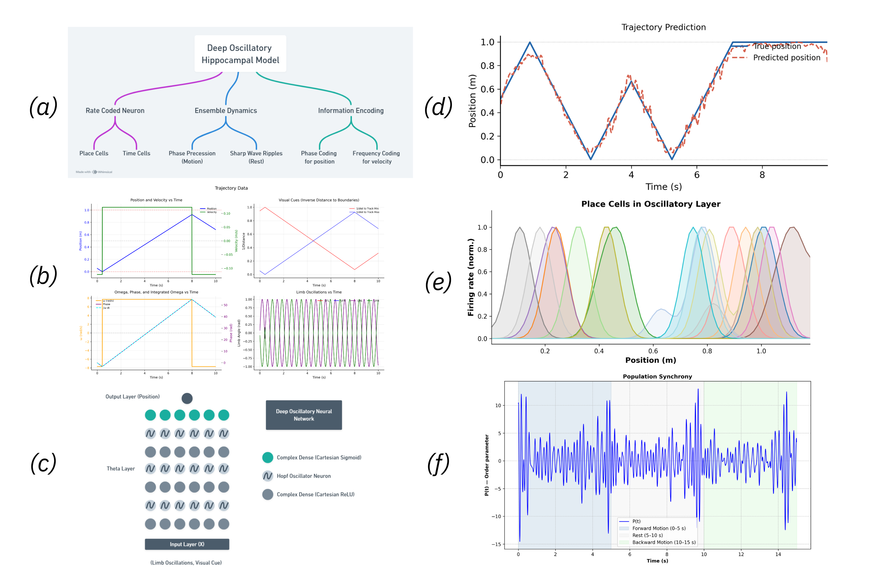 Figure 1. (a) Model Flowchart, (b) Input Data, (c) Oscillatory Neural Network Diagram, (d) Trajectory Prediction, (e) Place Cells - different colors correspond to different neurons, (f) Sharp Wave Ripples
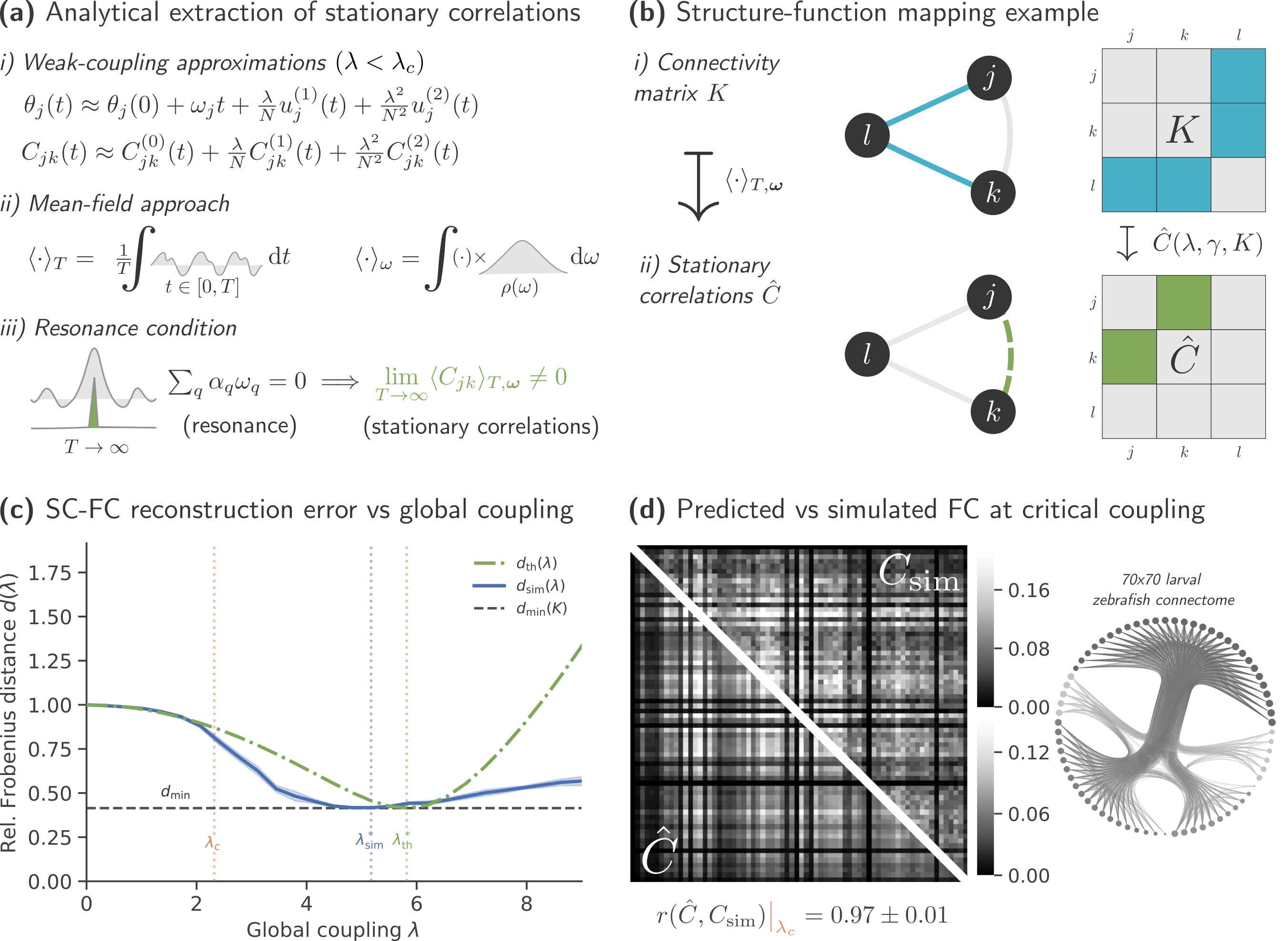 Figure 1. Predicting coactivity from anatomy in neural oscillators. (a) Derivation of predicted functional connectivity: phase trajectories are expanded, correlations averaged, and stationary terms selected. (b) Example for N=2 oscillators. (c) SC–FC reconstruction error follows theory up to synchronization (λc = 2.32). (d) Predicted and simulated FC remain highly similar (cosine similarity ≥ 0.97).
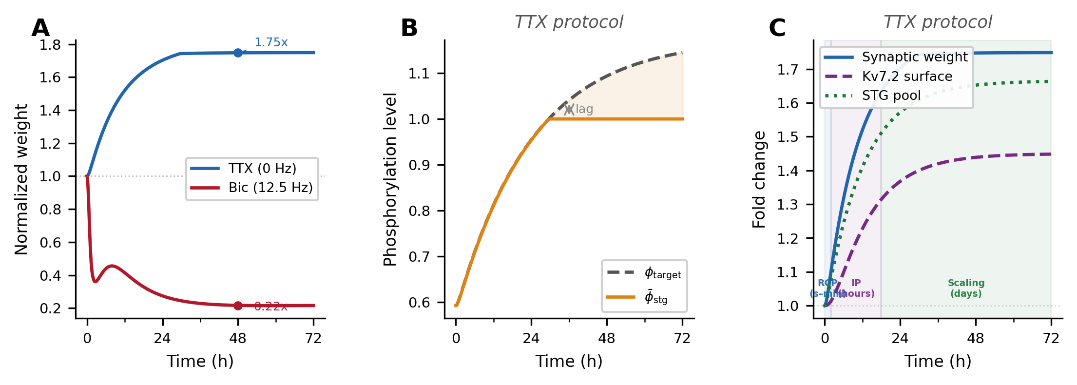 Figure 1. Simulated homeostatic response to inactivity (TTX). (A) Multiplicative synaptic scaling: upscaling (1.75×) and downscaling (0.22×) at 48 h. (B) Stargazin phosphorylation (φ̄_stg) lags the homeostatic target (φ_target) due to enzymatic inertia. (C) Three compensatory tiers emerge sequentially: AMPAR redistribution (seconds–min), Kv7.2 adjustment (hours), and synaptic scaling (days).
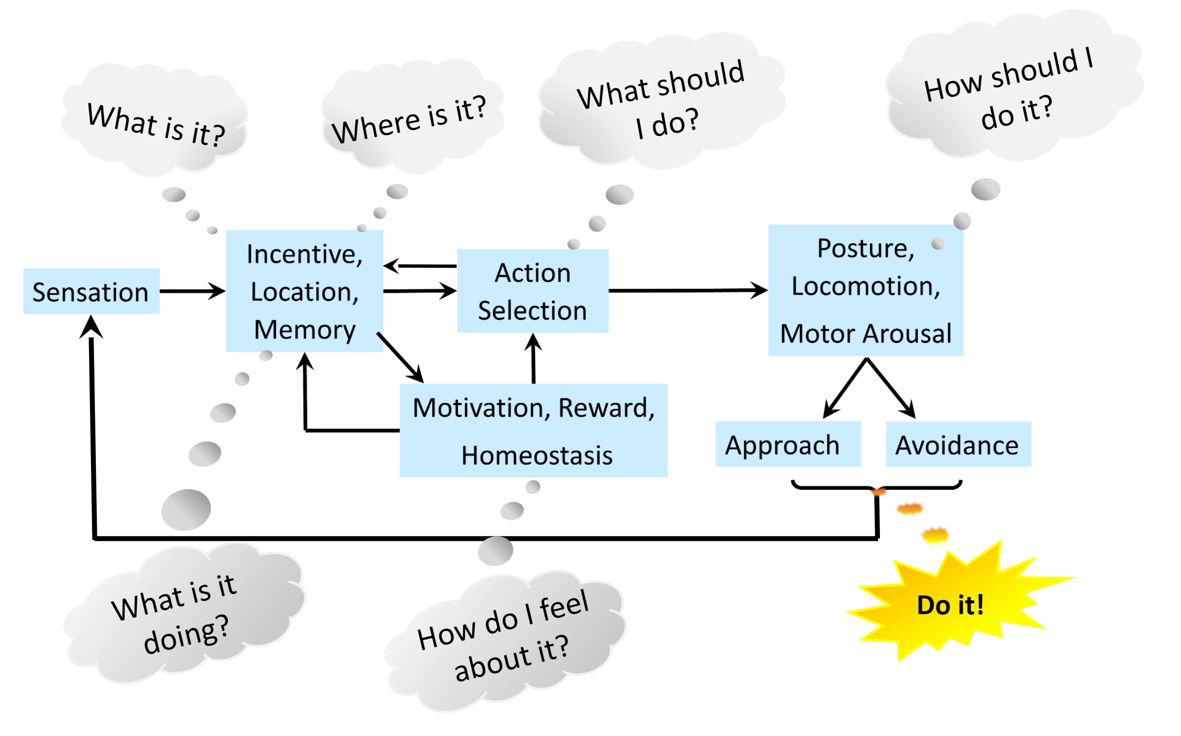 Figure 1. Both simple and complex animals handle flow of information from sensation to behavior with a common modular nervous system organization. Stimuli characteristics, incentives and locations are integrated with memory, motivation and affect for decisive action selection, with 5 critical computations from “What is it?” to “How should I do it?”, and cognitive mapping adding “What is it doing?”.

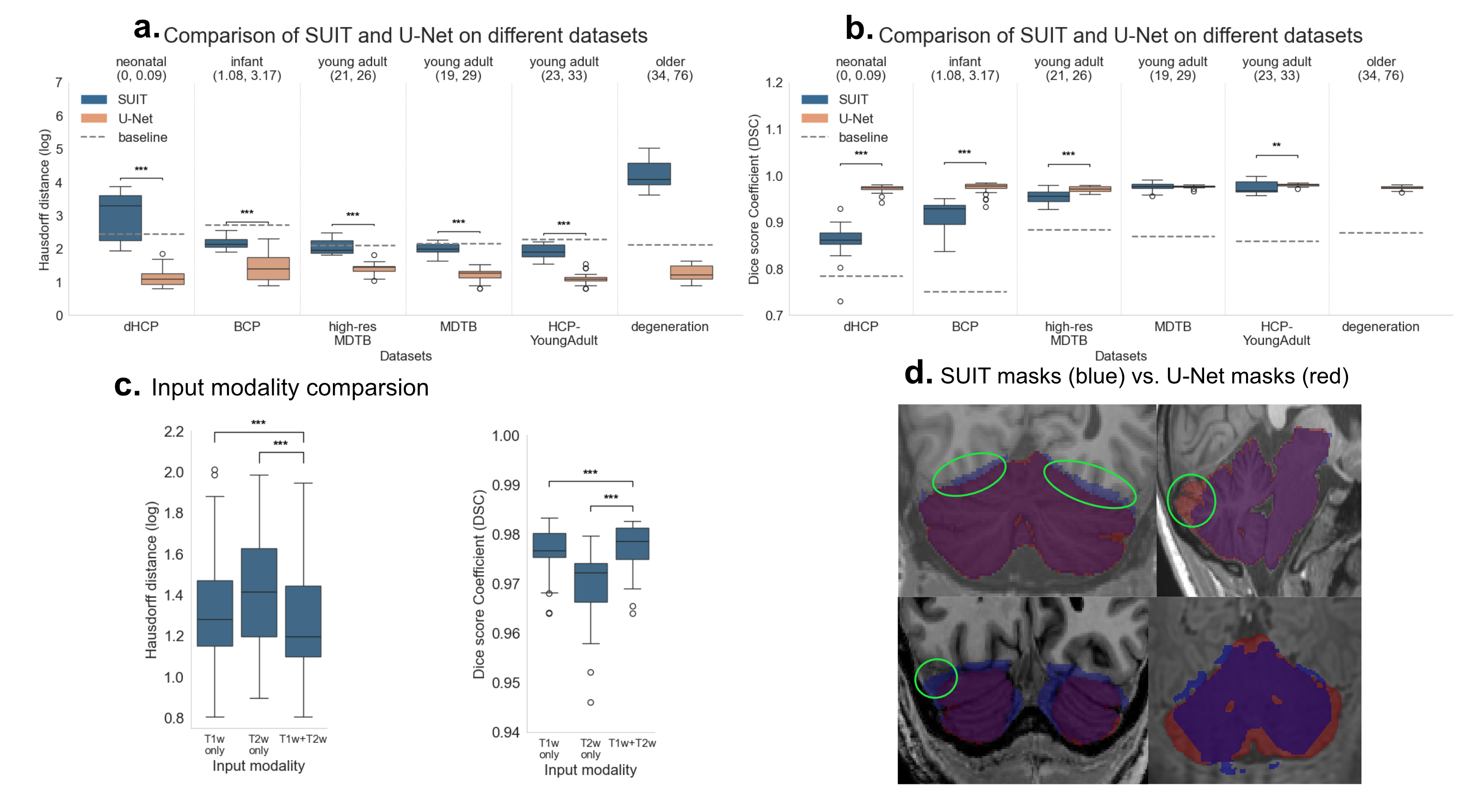 Figure 1. Isolation analysis. Comparison of U-Net VS SUIT for (a) Hausdorff Distance (HD) and (b) Dice Score Coefficient (DSC). c shows performance for different input modalities in the full datasets. Horizontal lines between bars with asterisks denote significant differences (paired t-tests). Baseline: Average mask prediction. d shows resulting mask in problematic subjects.
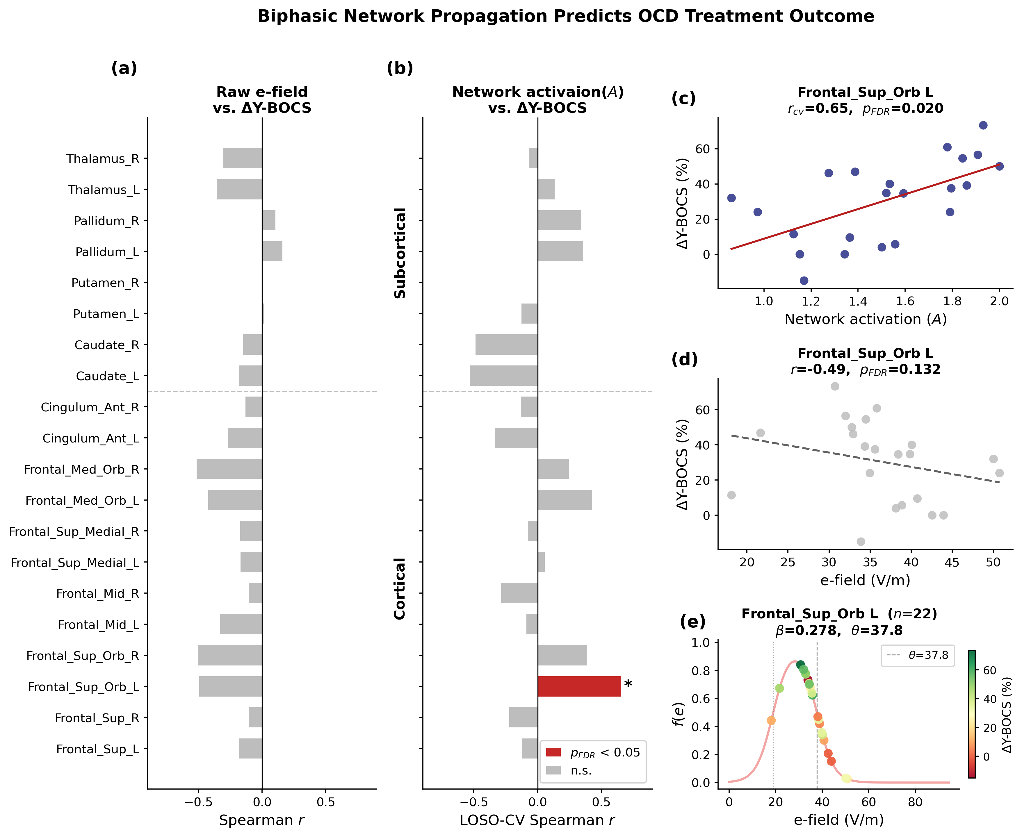 Figure 1. Correlations between E-field/network activation and clinical outcome in the CSTC ROIs. (a) Raw E-field showed no significant correlations. (b) The biphasic neuronal response model identified the left superior orbital frontal cortex as significantly associated with percentage Y-BOCS improvement. (c-f) Network activation/raw E-field correlation maps, and fitted biphasic neuronal response fReferences
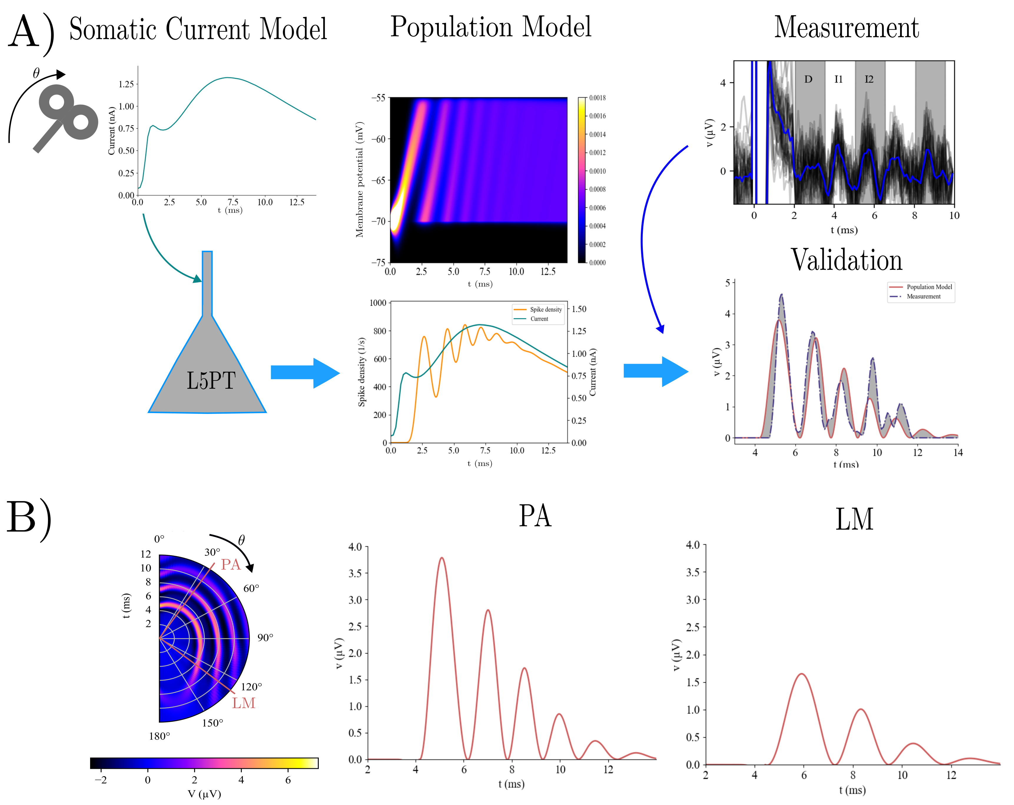 Figure 1. A) The somatic current model [3] generates coil orientation-sensitive somatic currents (first column). They are then applied to the L5PT model which computes membrane potential distribution and spike density for it (second column). This is then transformed to a potential and compared to measured I-waves. B) Orientation dependency of I-waves (first column) and potentials for putative parietal-anter
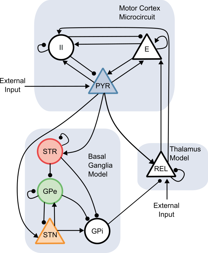 Figure 1. The BGTC circuit connectivity implemented in the neural mass model includes cortical excitatory (E), inhibitory interneuron (II), and deep pyramidal (DP) populations, as well as the striatum, globus pallidus externus (GPe), globus pallidus internus (GPi), subthalamic nucleus (STN), and thalamic relay nuclei (REL). Shaded regions indicate nodes with spectral data used for model fitting.
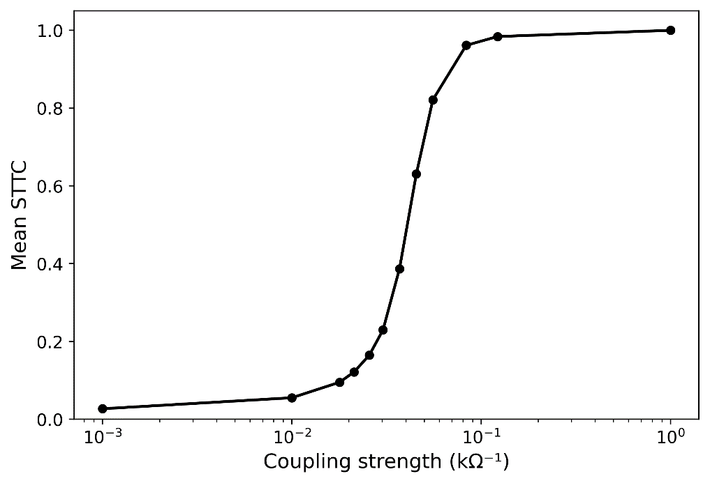 Figure 1. Mean spike time tiling coefficient (STTC) as a function of coupling strength in a network of 36 coupled stochastic relaxation-type oscillators. Increasing coupling drives the system from weakly correlated spiking activity toward global synchronization, indicating a continuous synchronization transition.

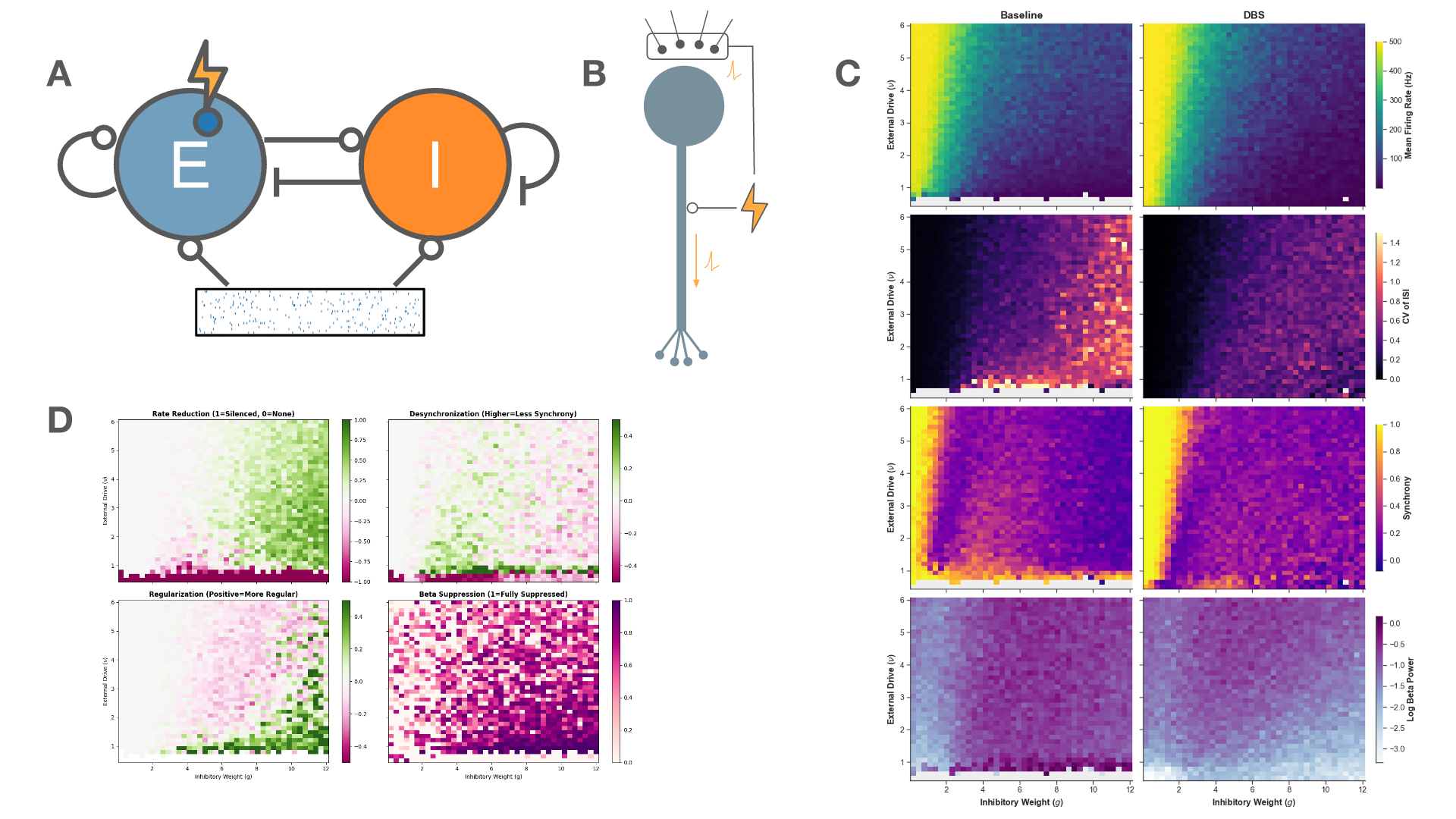 Figure 1. A: Schematic of the network architecture. A subset of the excitatory population is the target of stimulation. B: Schematic of the stimulation model. C: The firing rate, regularity, synchrony, and beta-band power across the parameter space for baseline (left) and 130 Hz stimulation (right). D: The effect of stimulation on metrics of therapeutic efficacy
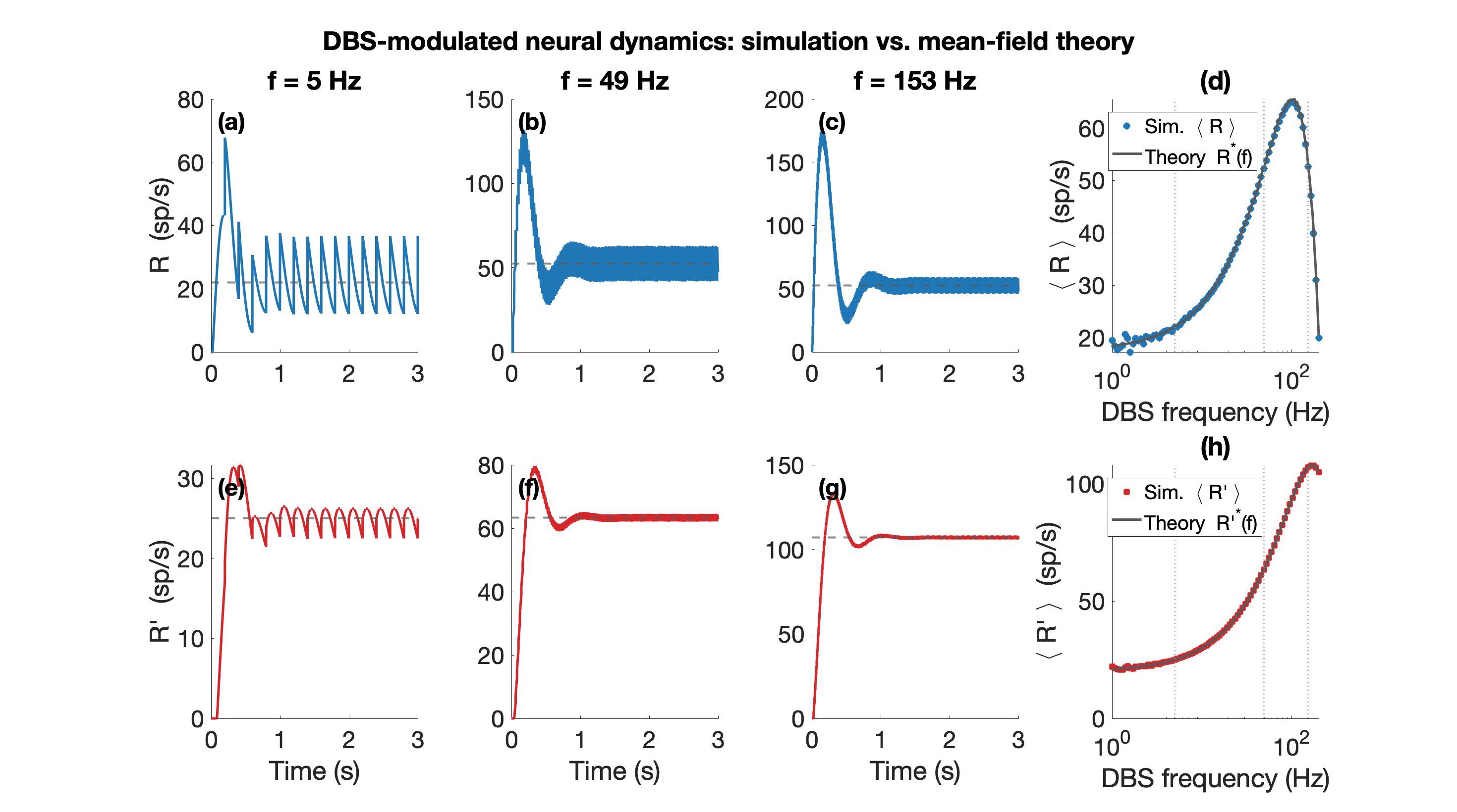 Figure 1. Mean-field theory vs. simulation (N=100 per population). (a)-(c) Excitatory rate R(t) over 0-3 s at f=5, 49, 153 Hz (blue); grey dashed: mean-field prediction; rate fluctuates around mean. (e)-(g) Inhibitory rate R'(t) (red), same convention. (d) Mean R and (h) mean R' at steady state vs. DBS frequency (log scale); circles: simulation; grey line: theory.
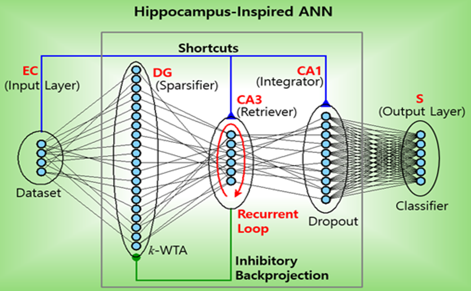 Figure 1. Hippocampus-inspired artificial neural network (ANN). Feedforward: EC (entorhinal cortex) → DG (dentate gyrus) → CA3 and Shortcuts (SCs): EC → CA3 and EC → CA1 and inhibitory backprojection: CA3 → DG. S: subiculum.References
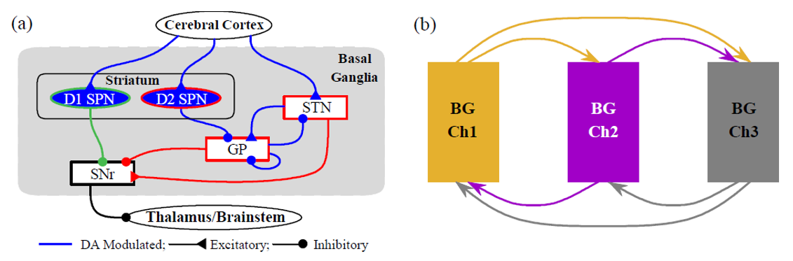 Figure 1. (a) Single-channel BG circuit. Green and red lines represent direct pathway (DP) and indirect pathway (IP) to the output nucleus, SNr, respectively. (b) Three-channel BG SNN. Channels 1-3 represent actions and are shown in orange, purple, and gray, respectively.References
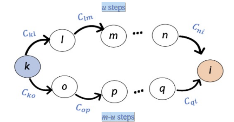 Figure 1. Deviation from stability D_st corresponds to a weighted count of convergent walks on the network C
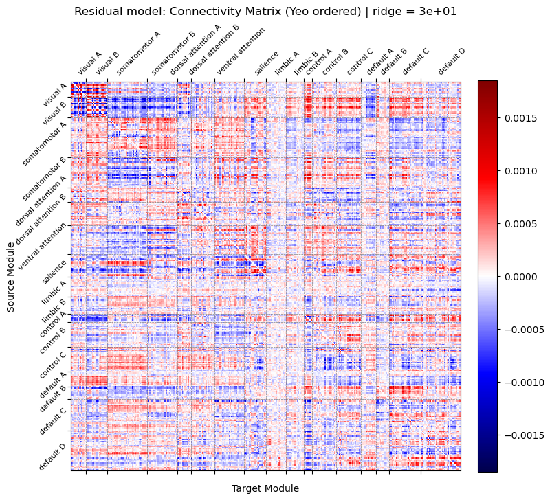 Figure 1. Connectivity matrix estimated from residual model using ridge regression (λ = 30.0) and reordered by Yeo 17 functional networks. The value at row i and column j represents the predictive weight from source node i to target node j. Red: positive predictive weights. Blue: negative predictive weights.
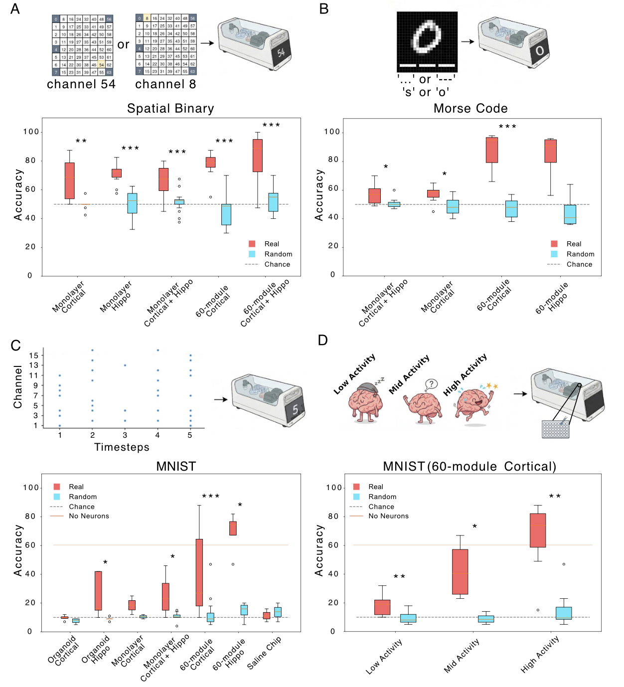 Figure 1. Binary classification (all distances). Red: neuronal cultures; cyan: shuffled controls. (B) Morse code: accuracy for letter prediction; X-axis cell type/activity; dark green real, light green shuffled. (C) MNIST: digit-prediction accuracy; same axes/colors; dashed line chance. (D) Cortical 60-module MNIST accuracy vs activity (low/med/high). *p<0.05, **p<0.01, ***p<0.001.
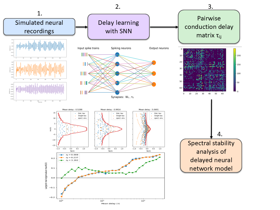 Figure 1. Pipeline for data-driven inference of conduction delays and stability analysis of delayed neural networks. Simulated neural recordings are used to train a spiking neural network that infers a pairwise delay matrix τ. The learned delays are incorporated into delayed neural network models whose spectral properties and stability are analyzed.
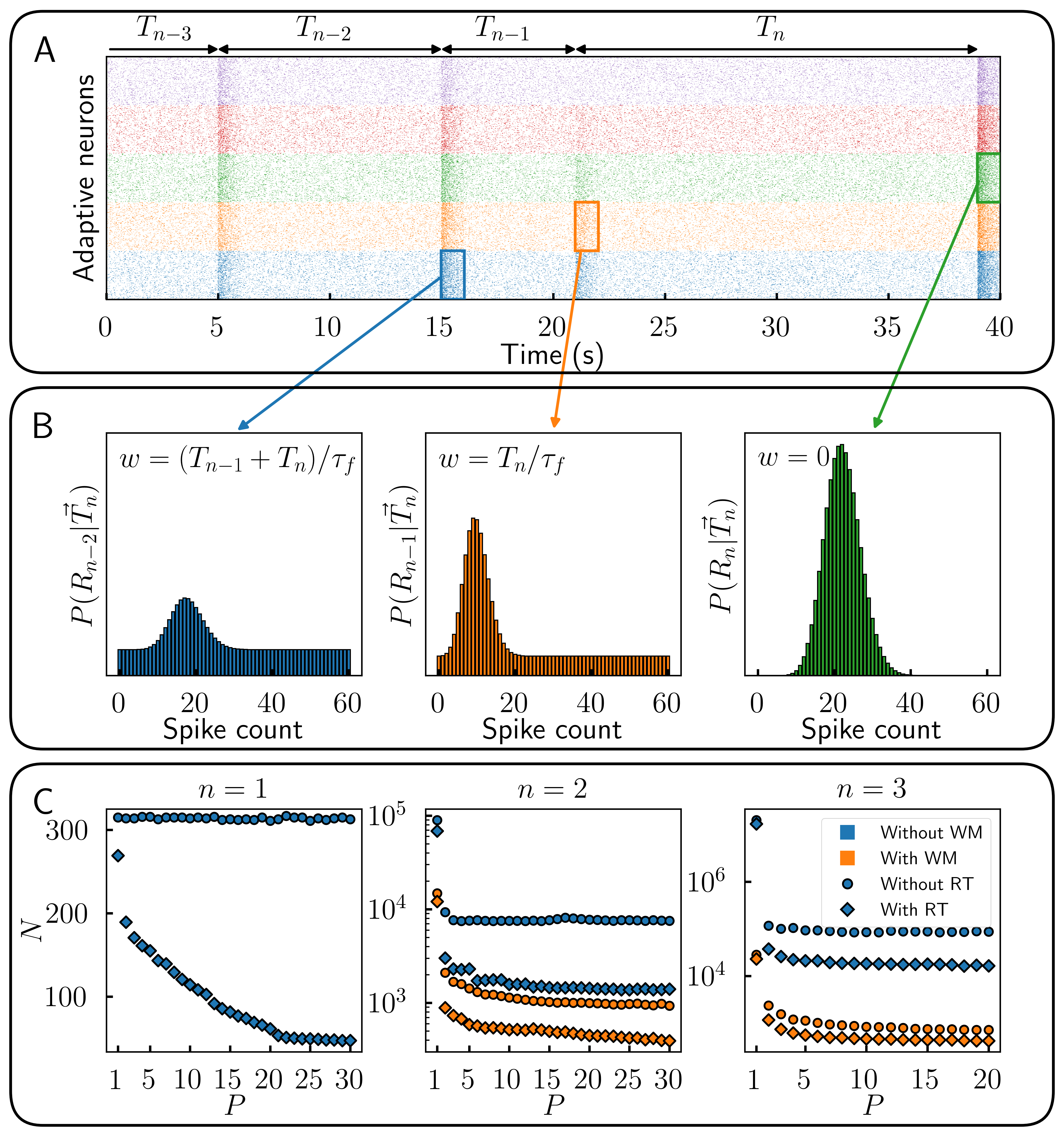 Figure 1. Encoding time sequences is more efficient with parametric heterogeneity. (A) Responses of multiple populations of adaptive cells with response threshold. (B) Recollection of past responses (working memory) during event n. (C) Number of cells N necessary to reach 80% of theoretical maximum information content about a sequence of length n for different number of optimized populations P.
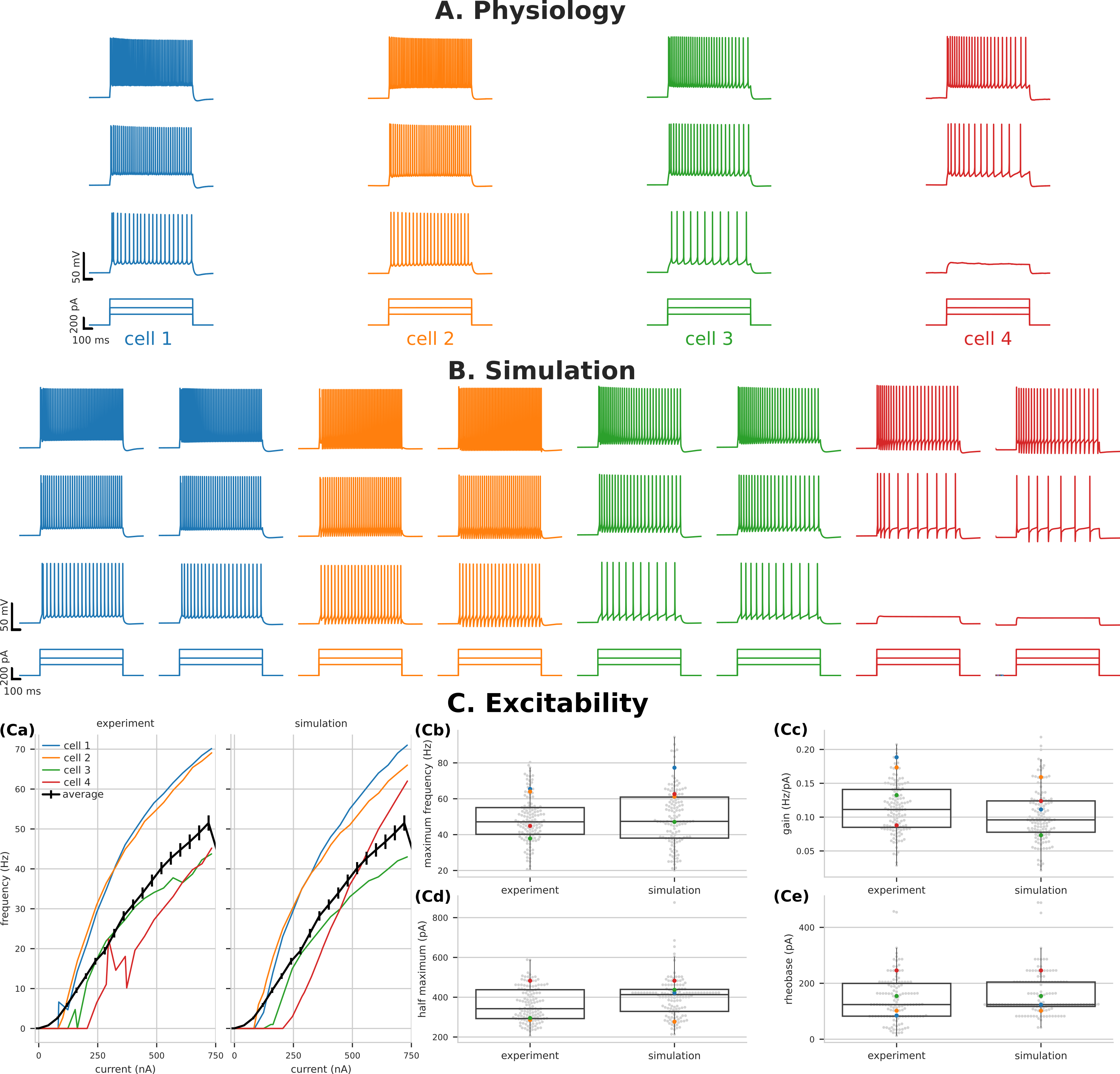 Figure 1. Variability of PT5B excitability captured by parameter optimization. Voltage traces of PT5B neurons to current clamp at (160 pA, 320 pA, and 480 pA) (A) Experiments, (B) Simulation. (C) Excitability measures demonstrate the variability seen between cells and the ability of parameter optimization to capture both individual responses (highlighted) and the population distribution.
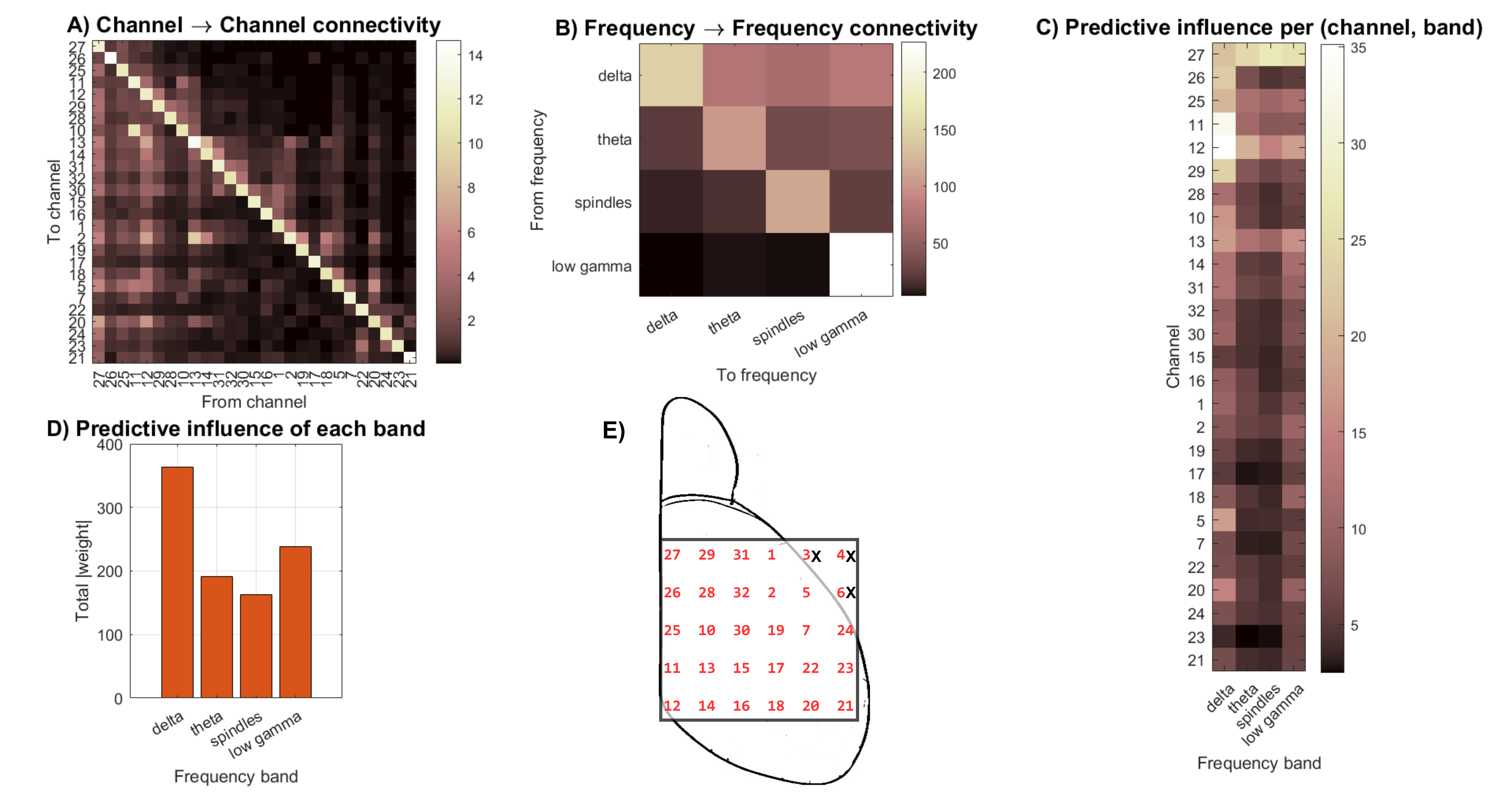 Figure 1. A) Cross-channel interactions summed over all frequency bands. B) Cross-frequency interactions summed over all channels. C) Summed band activation per channel. D) Frequency band predictive influence in future states. E) Illustration of the mouse dorsal portion of the cortex with the 32-electrode ECoG grid.
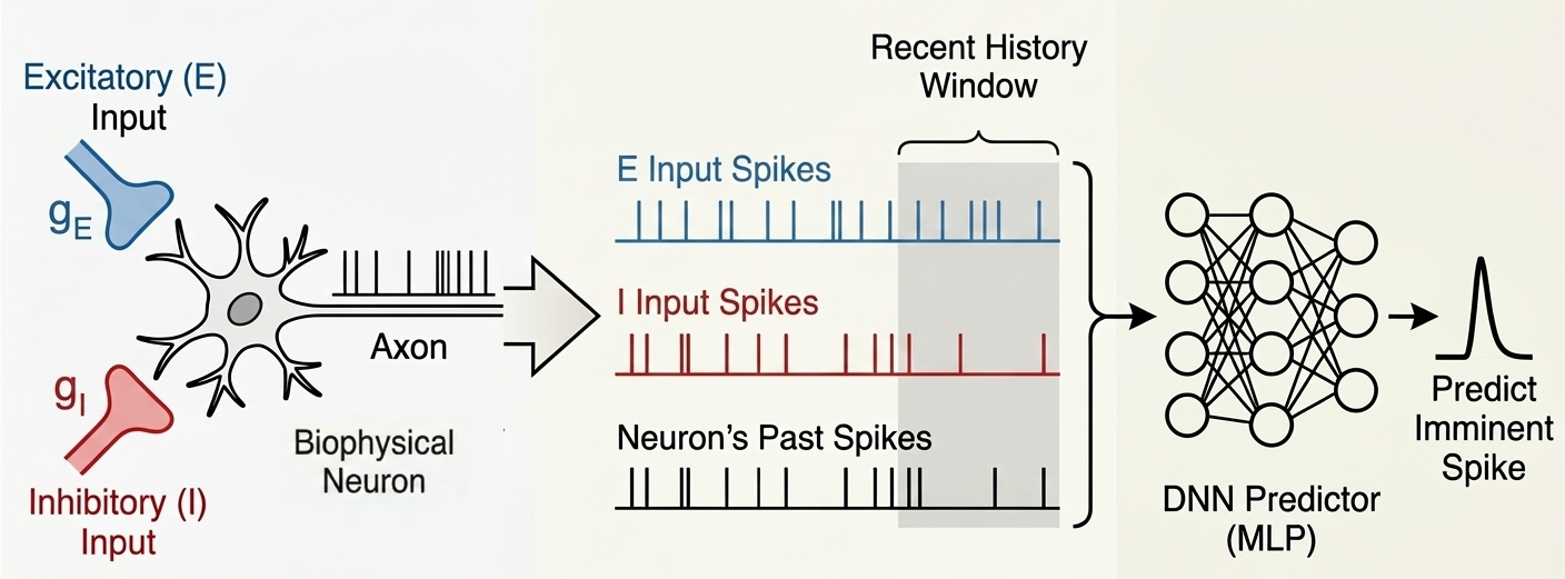 Figure 1. Schematic overview of the spike prediction pipeline. A biophysical neuron model receives balanced excitatory and inhibitory synaptic inputs. The recent temporal history of these inputs, along with the neuron’s own past output spikes, is extracted and fed into a deep neural network (DNN) to predict imminent spikes.
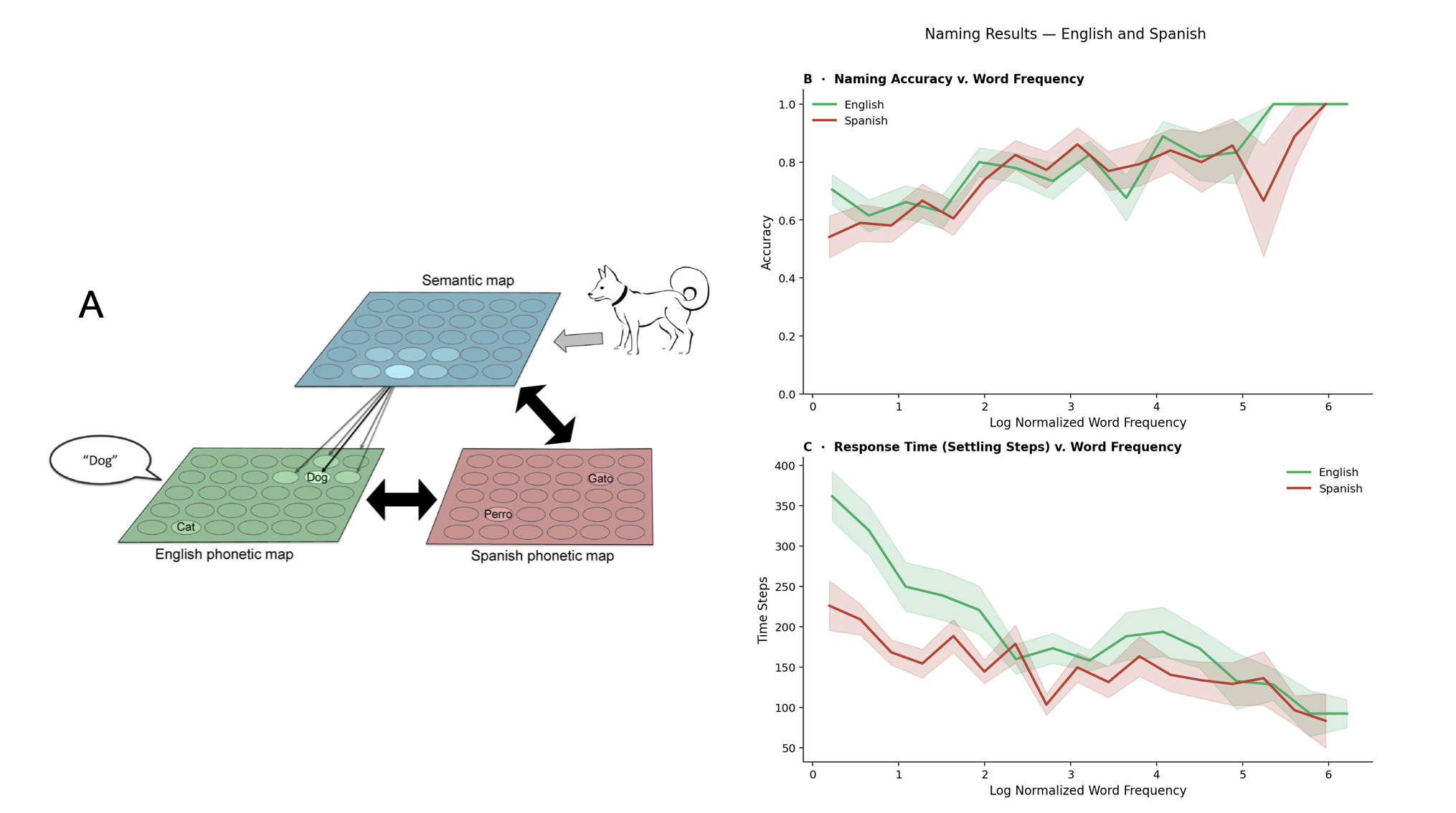 Figure 1. Left: BiLex model with lateral connections, adapted from [1]. Naming is simulated by presenting an input to the semantic map, propagating activation through bidirectional associative connections, and producing a response from a phonetic map, in English and Spanish. Right: accuracy significantly increased with word frequency (p < 0.001) while response times were significantly faster (p < 0.001).
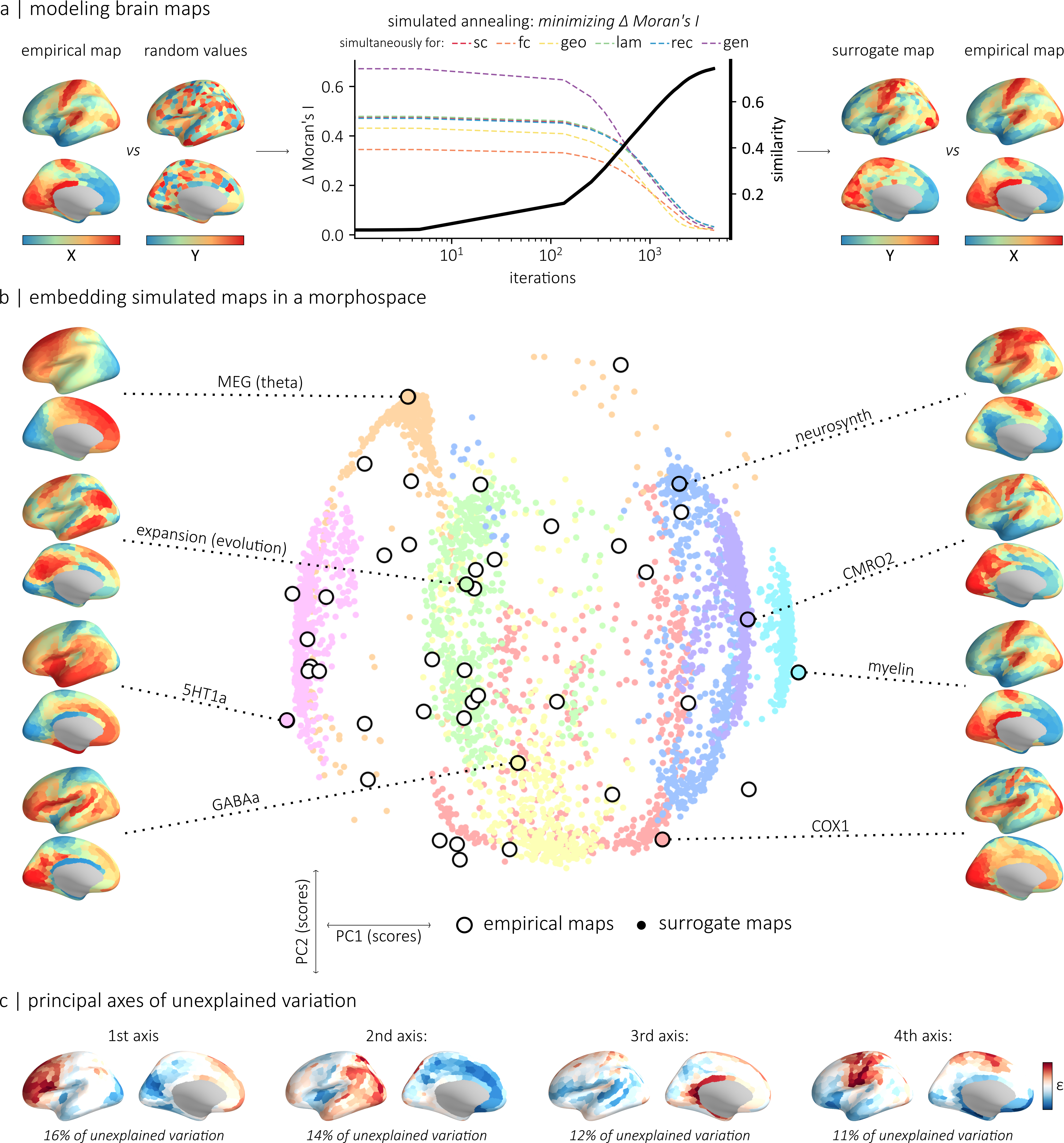 Figure 1. (a) The generative model relies on simulated annealing to randomly permute values while minimizing the difference in autocorrelation between empirical and simulated maps. (b) Morphospace summarizing the topographic properties of the empirical and simulated maps. (c) We identified the four main axes of variance in a matrix of regional difference between simulated and empirical values.References
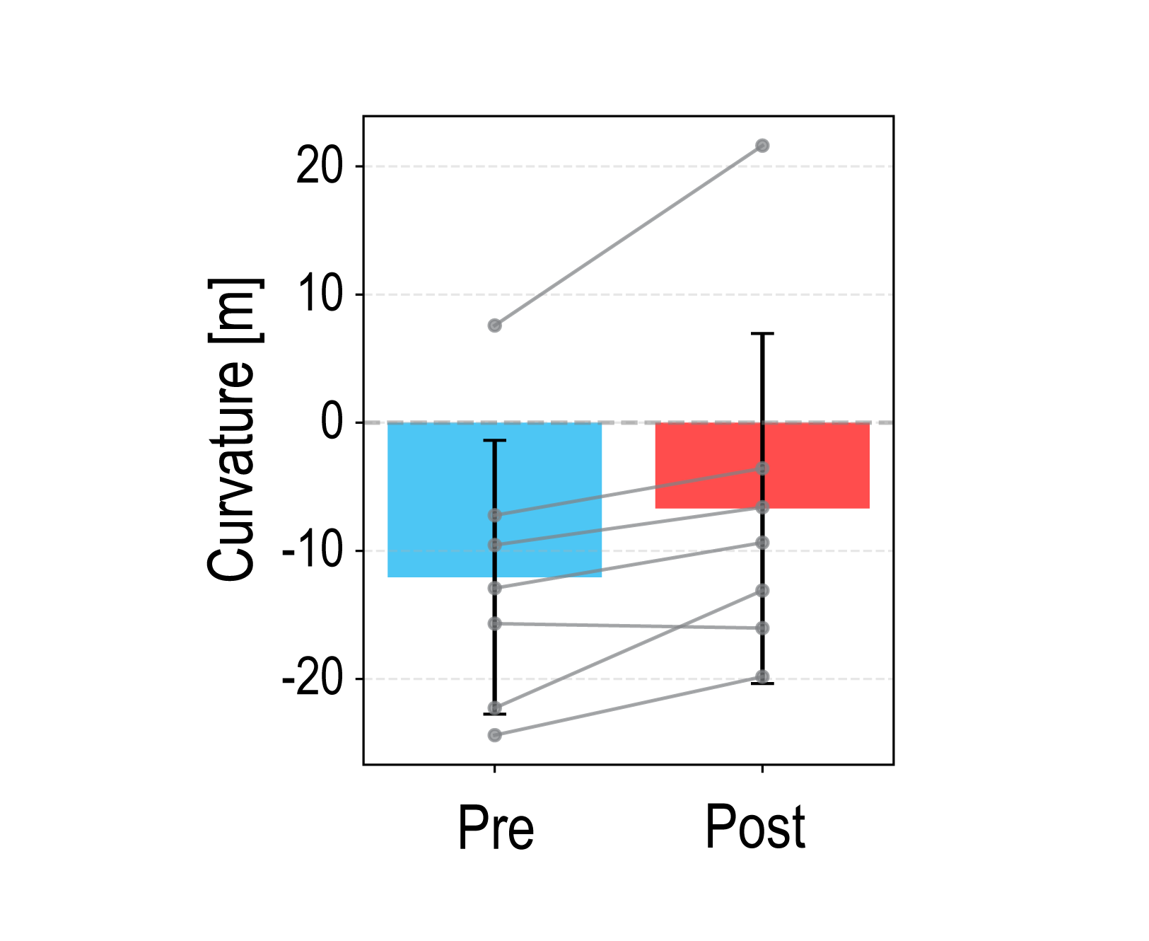 Figure 1. Mean PSE curvature across participants in pre- and post-adaptation curvature discrimination tests. Error bars represent the standard deviation. Positive and negative values indicate an upward- and downward-convex curves, respectively. Gray dots represent individual participant data.
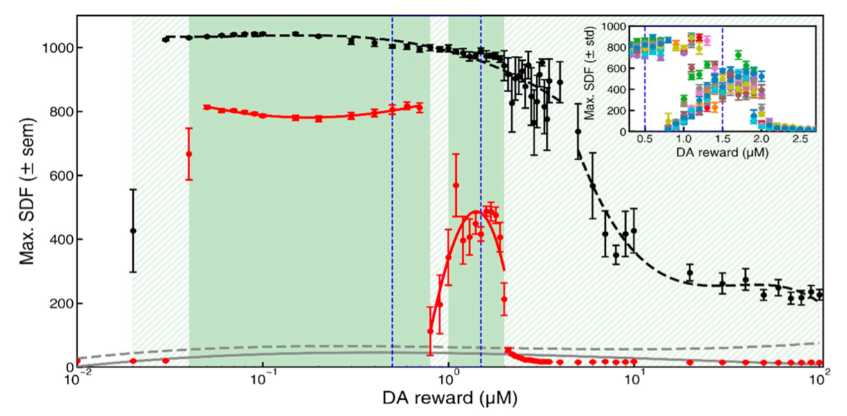 Figure 1. Learning performance as a function of dopamine reward concentration. Mean SDF peak responses during post-training testing are shown for the original Izhikevich model (black dashed line) and the modified model (red solid line), averaged over (N = 11) simulations; error bars indicate SEM. Gray curves represent responses to non-rewarded stimuli. Green shading marks regions with AUC ≥ 0.9.
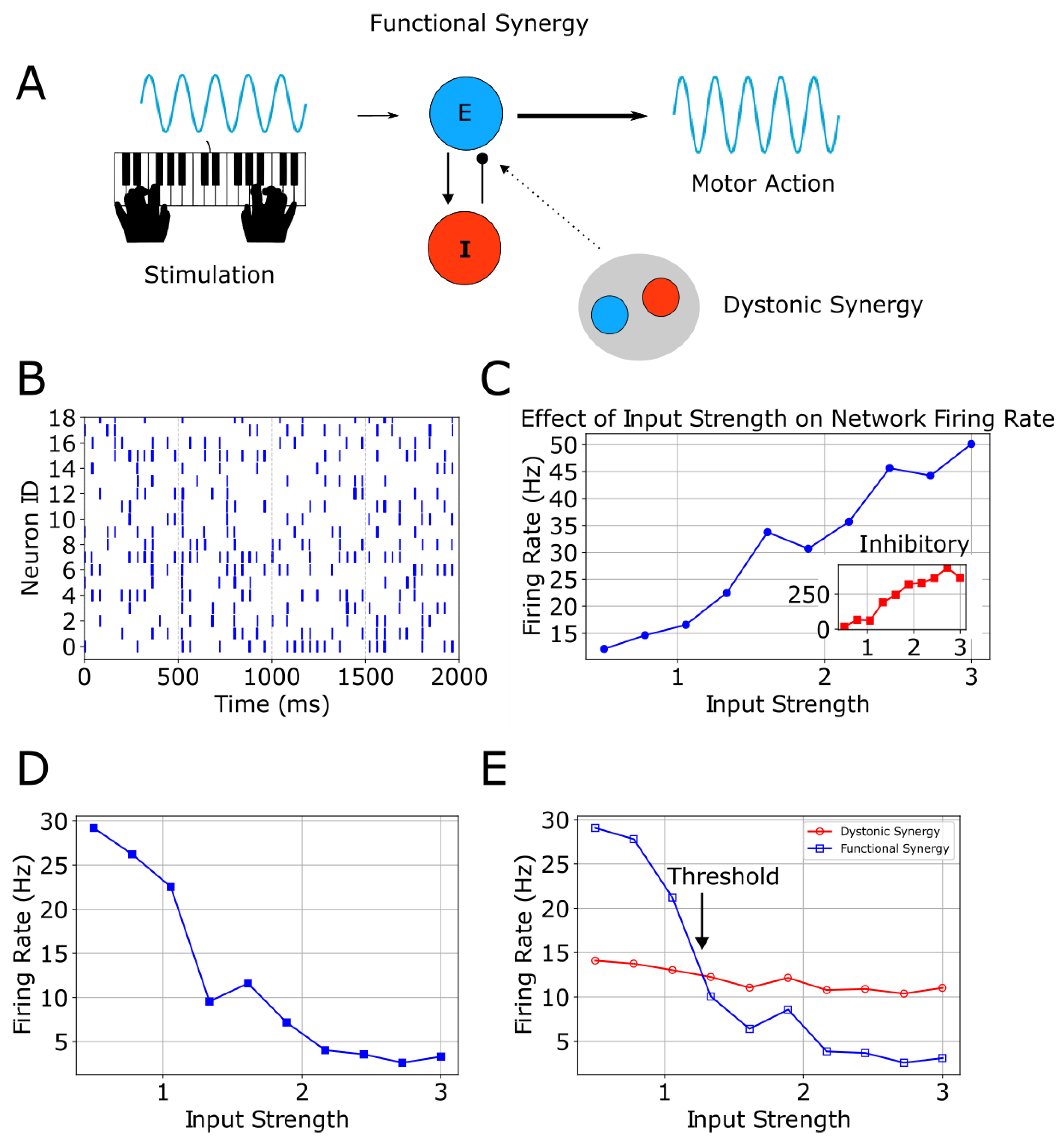 Figure 1. A, stimulation evokes motor action via functional excitatory/inhibitory synergy, with optional overlapping dystonic synergy. B, healthy-state raster shows regular spikes across neurons. C, firing rate increases with input strength; inset shows inhibitory activity. D, altered E/I balance produces a decreasing response. E, dystonic and functional firing diverge at a threshold across input levels.
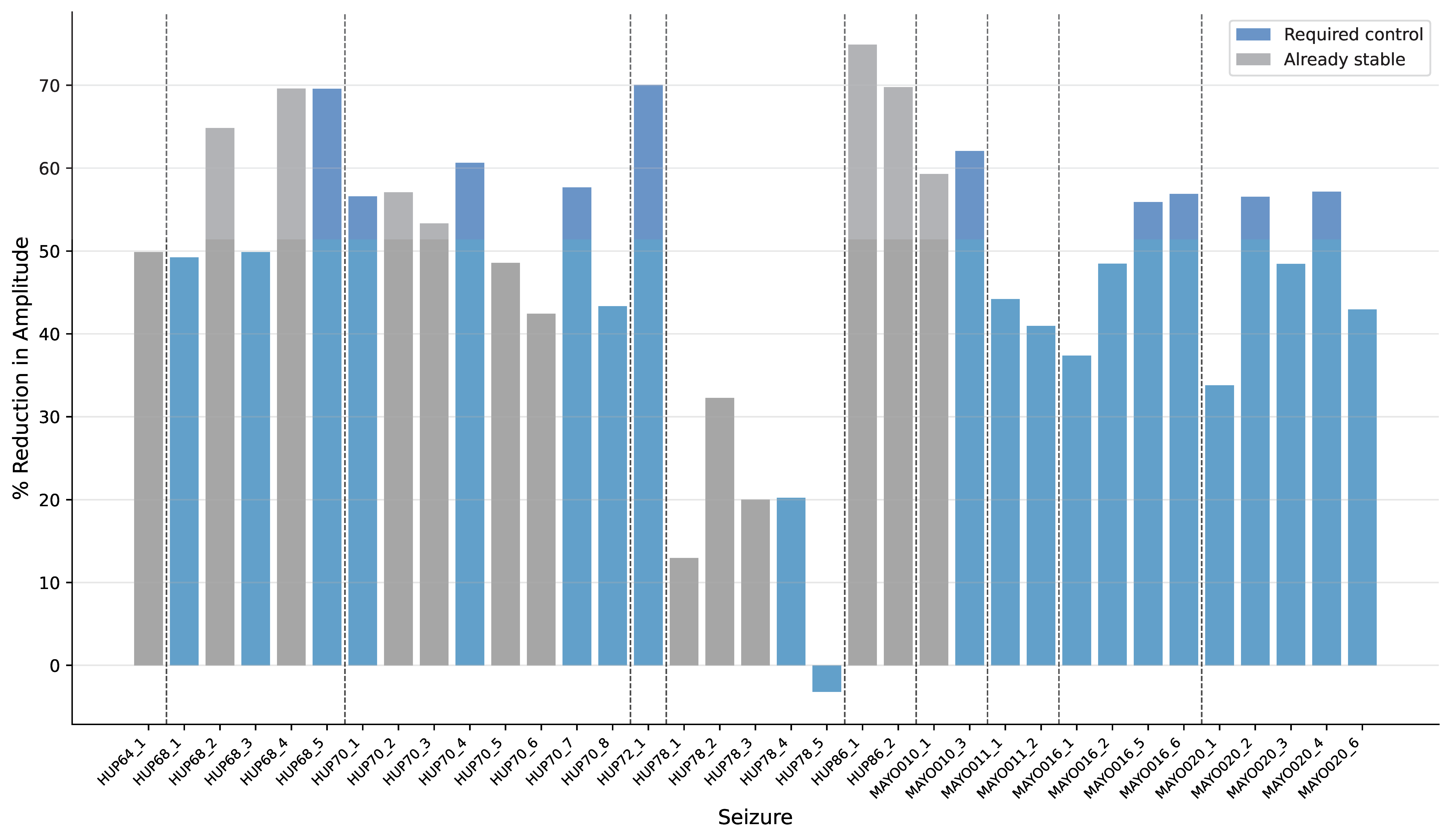 Figure 1. Percentage amplitude reduction for each seizure. Gray bars represent seizures that are already stable (maximum eigenvalues < 1), while blue bars indicate seizures that require stabilization. Vertical dashed lines separate patients. Only 1 seizure increased in amplitude after control. Control reduced amplitude by an average of 48.96% + 16.94%.
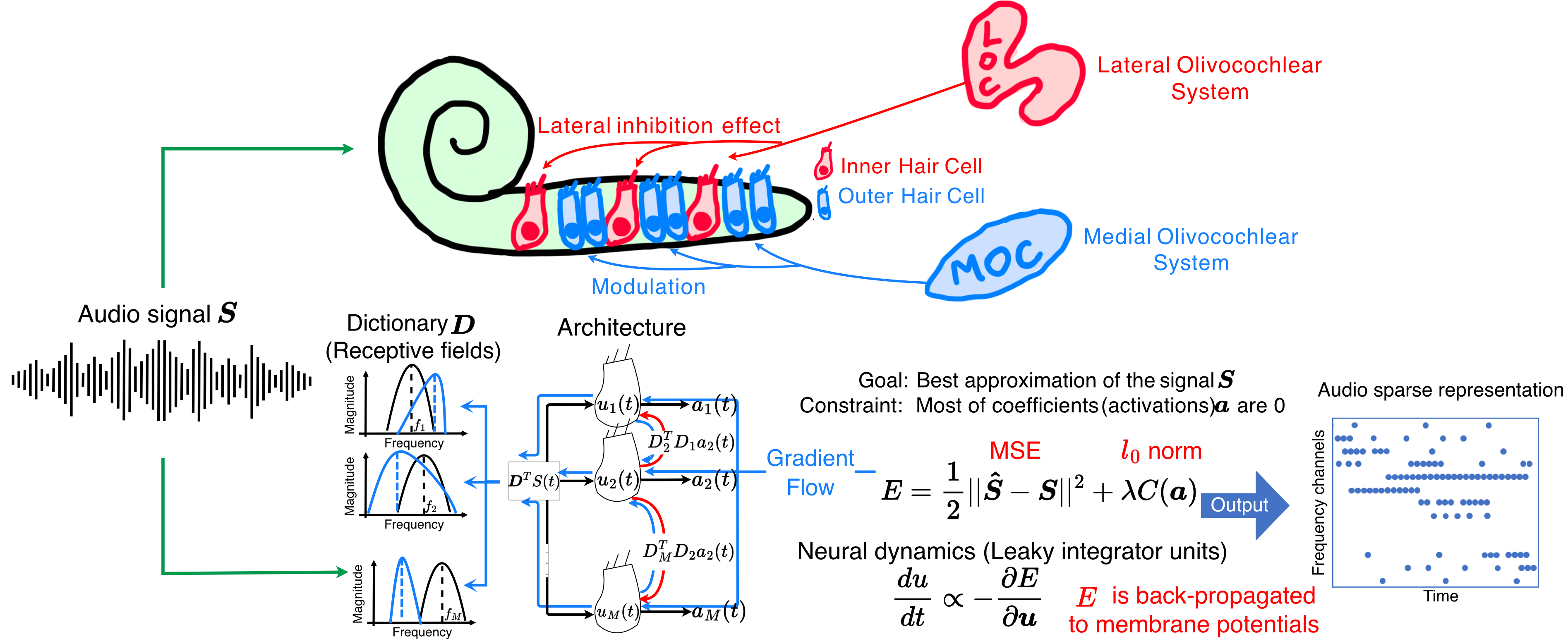 Figure 1. Overview of the ALCA-CF front-end. Each filter is represented by a neuron with a receptive field. Red arrows are lateral inhibition synapses and blue arrows are the feedback that adapts each neuron's receptive field. Lateral inhibition weights are the correlation between pre- and post-synaptic neuron receptive fields. Neuron activations ai are represented by blue dots in the time-frequency output.
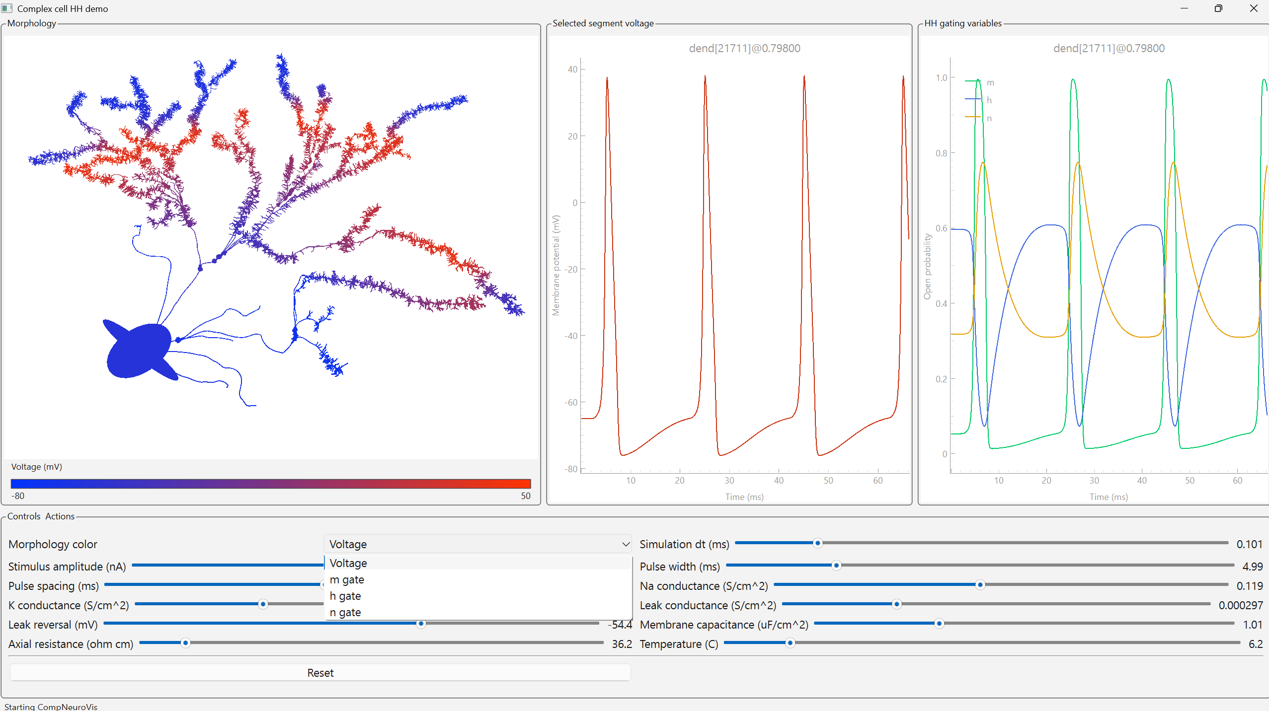 Figure 1. A CompNeuroVis application built around a compartmental NEURON model of a reconstructed cell with Hodgkin-Huxley dynamics. The morphology is color-coded by a selected variable, here membrane voltage. For a selected segment, linked plots show membrane voltage and the gating variables m, h, and n. A dropdown sets the mapped variable and sliders adjust stimulus and biophysical parameters.
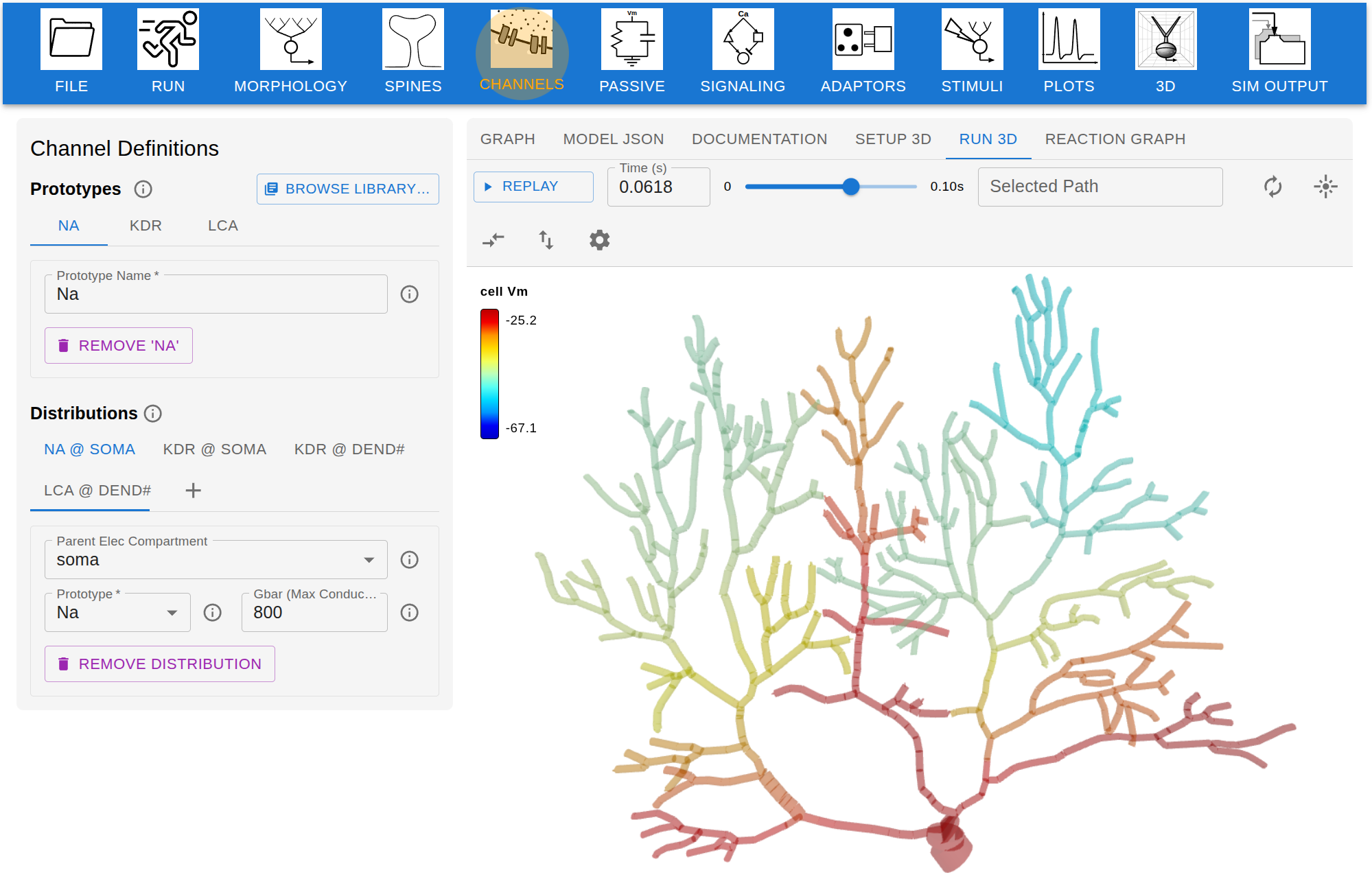 Figure 1. Screenshot of Jardesigner GUI. The menu options are in the blue bar above, and the Channel Menu box is open to the left. A snapshot of the current simulation is presented in the 3D display to the right.

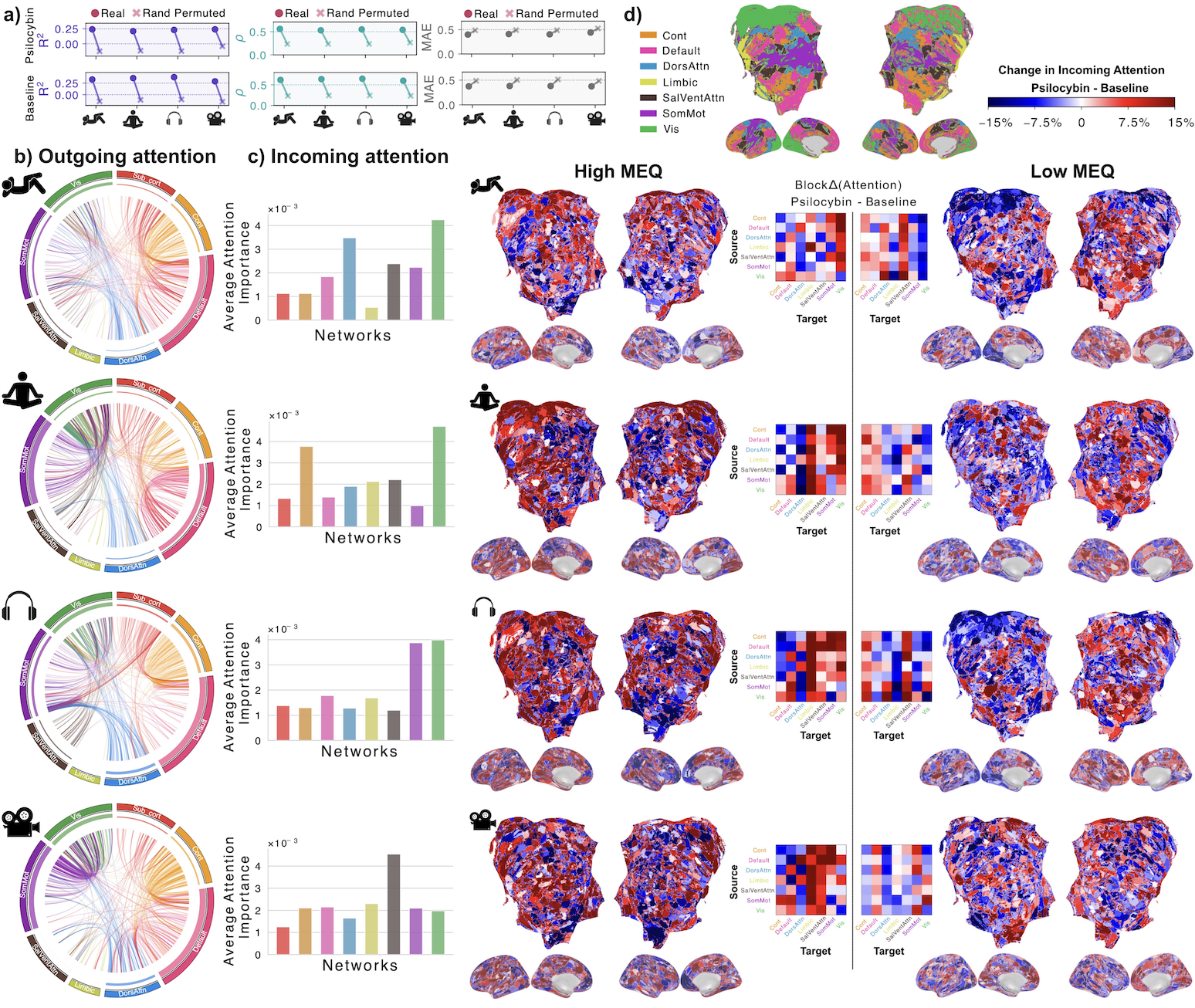 Figure 1. BrainSymphony reconstruction and attention-based reorganization. (a) Paired dots: real vs permuted ROI series across conditions; higher R²,r, lower MAE. (b) Circos: Admin–Baseline attention Δ (top 500 edges) colored by source network; inner track = total outgoing. (c) Network-mean incoming attention Δ. (d) High vs Low MEQ receptive-attention maps plus inter-network Δ matrices.
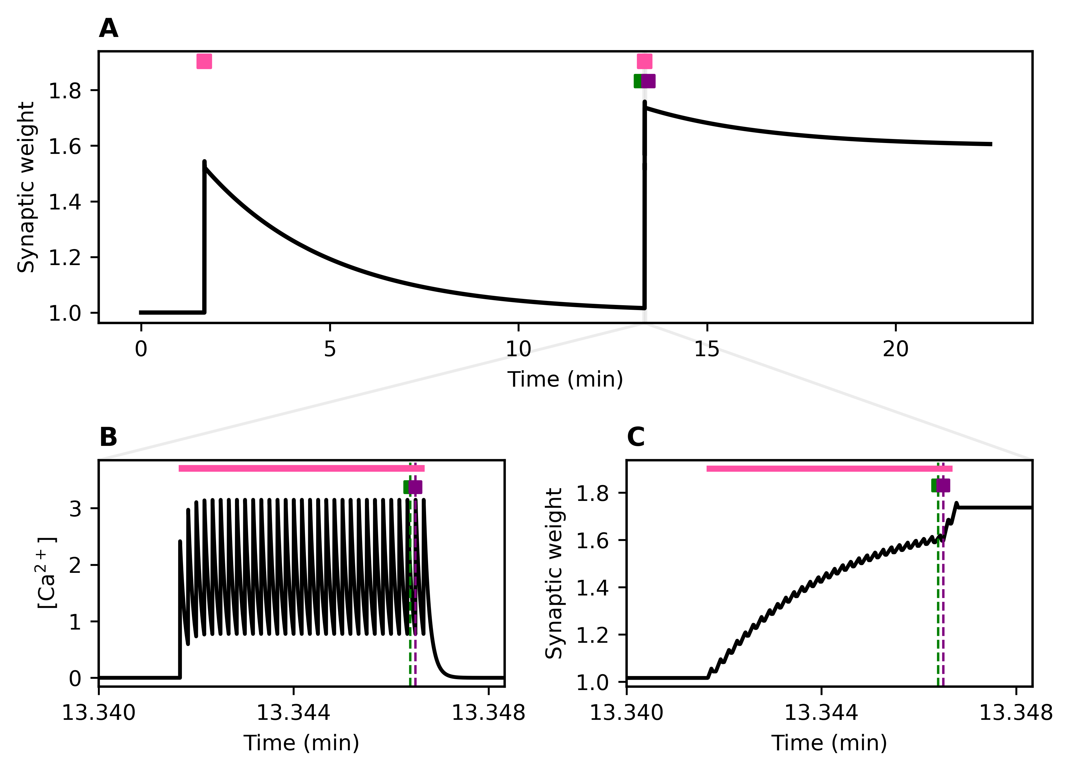 Figure 1. Stochastic activity-driven ER entry and stabilization preserve calcium-dependent plasticity over long timescales. (A) Identical high-frequency pre/post spike trains (pink) produce synaptic weight changes; the first stimulation fails to trigger ER entry, while the second induces ER entry (green) followed by stabilization (purple). (B–C) Insets show calcium (left) and weight (right) dynamicsReferences
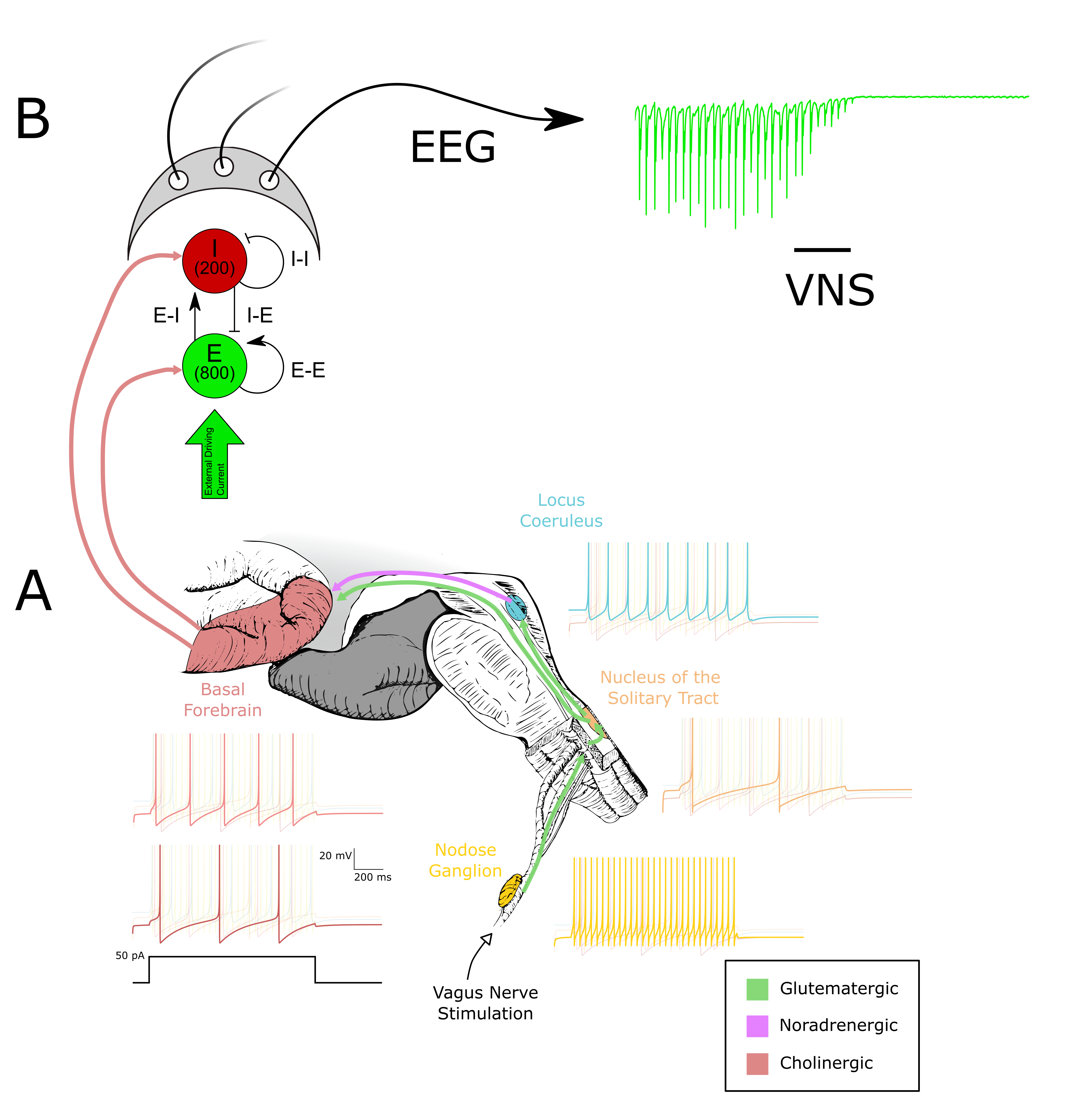 Figure 1. (A) The circuitry between the vagus nerve and the basal forebrain is modeled using quadratic integrate-and-fire (Izhikevich) neurons fitted to experimental data. Representative voltage responses to a 50 pA injection are shown. (B) The output of the basal forebrain in (A) is used to modulate ACh-sensitive K+ channels in an E–I network. Synaptic activity within this network is used to compute an EEGReferences
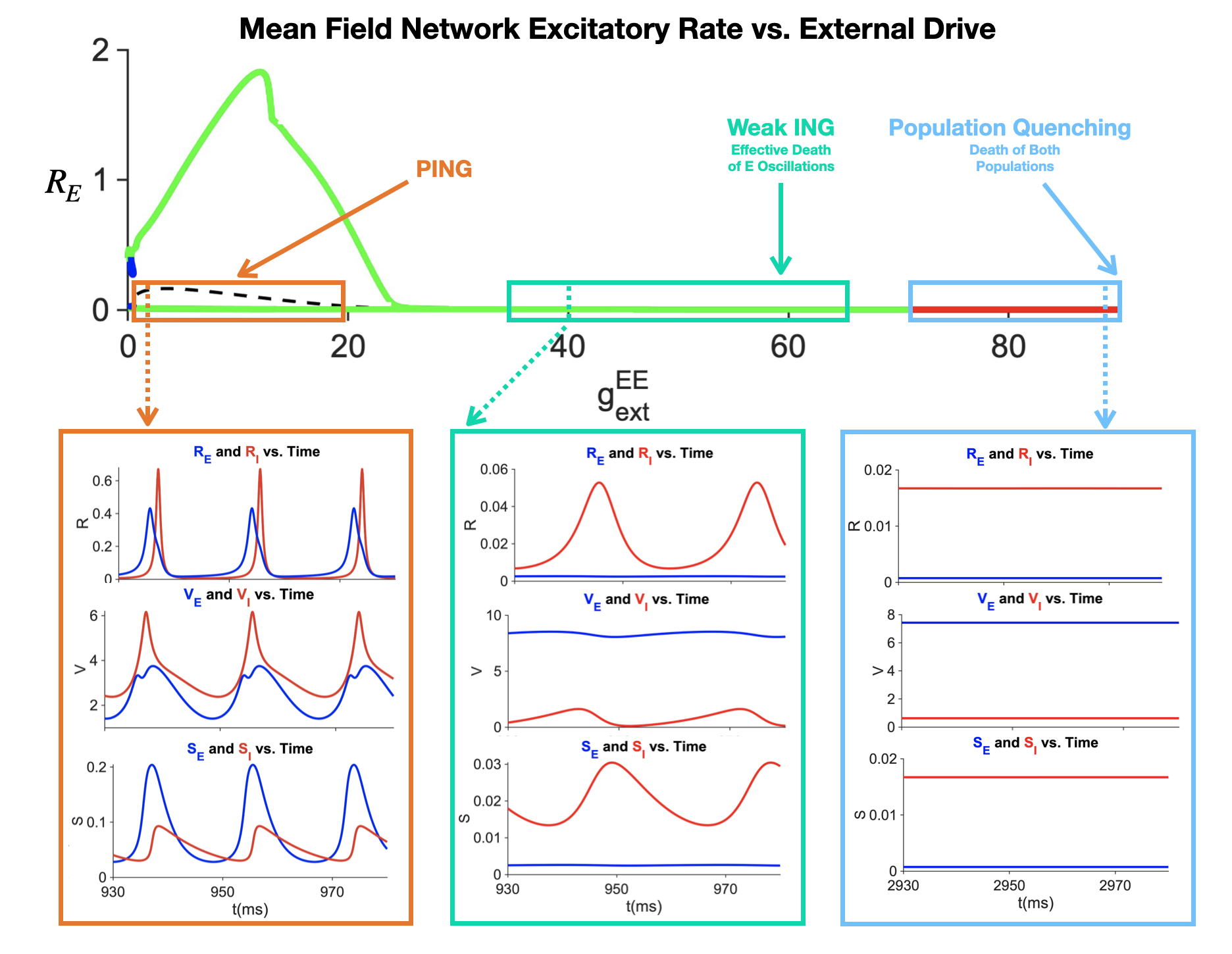 Figure 1. E-I Network dynamics as a function of external excitatory conductance drive in high input regime
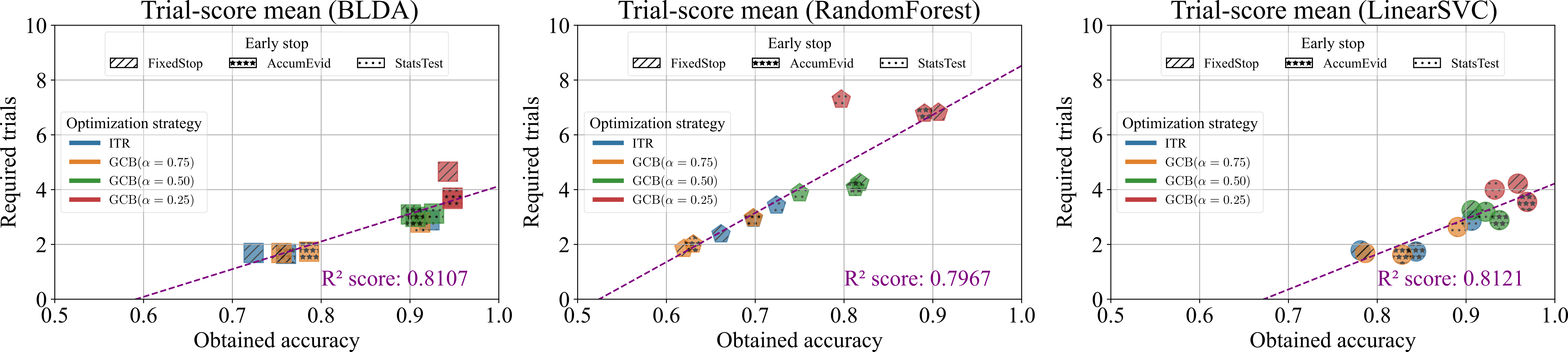 Figure 1. Required trials and obtained accuracies across classifiers, early-stopping strategies, and optimization methods for Hoffmann et. al. Rapid Serial Visual Presentation dataset [1]. Points show mean performance under leave-one-session-out validation. The fitted line illustrates the speed–accuracy trade-off.
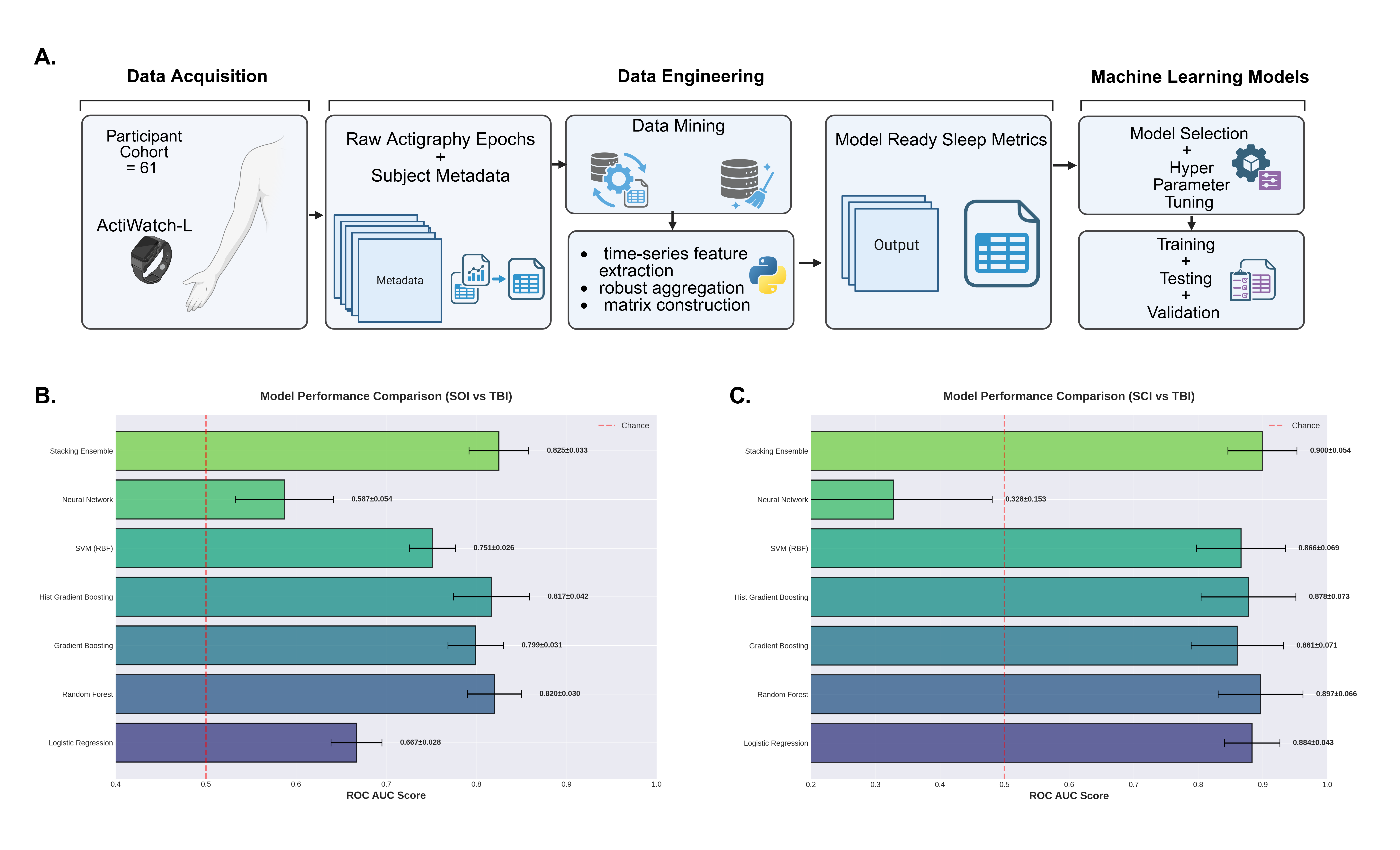 Figure 1. Actigraphy-based sleep feature pipeline and machine learning model performance for TBI classification.
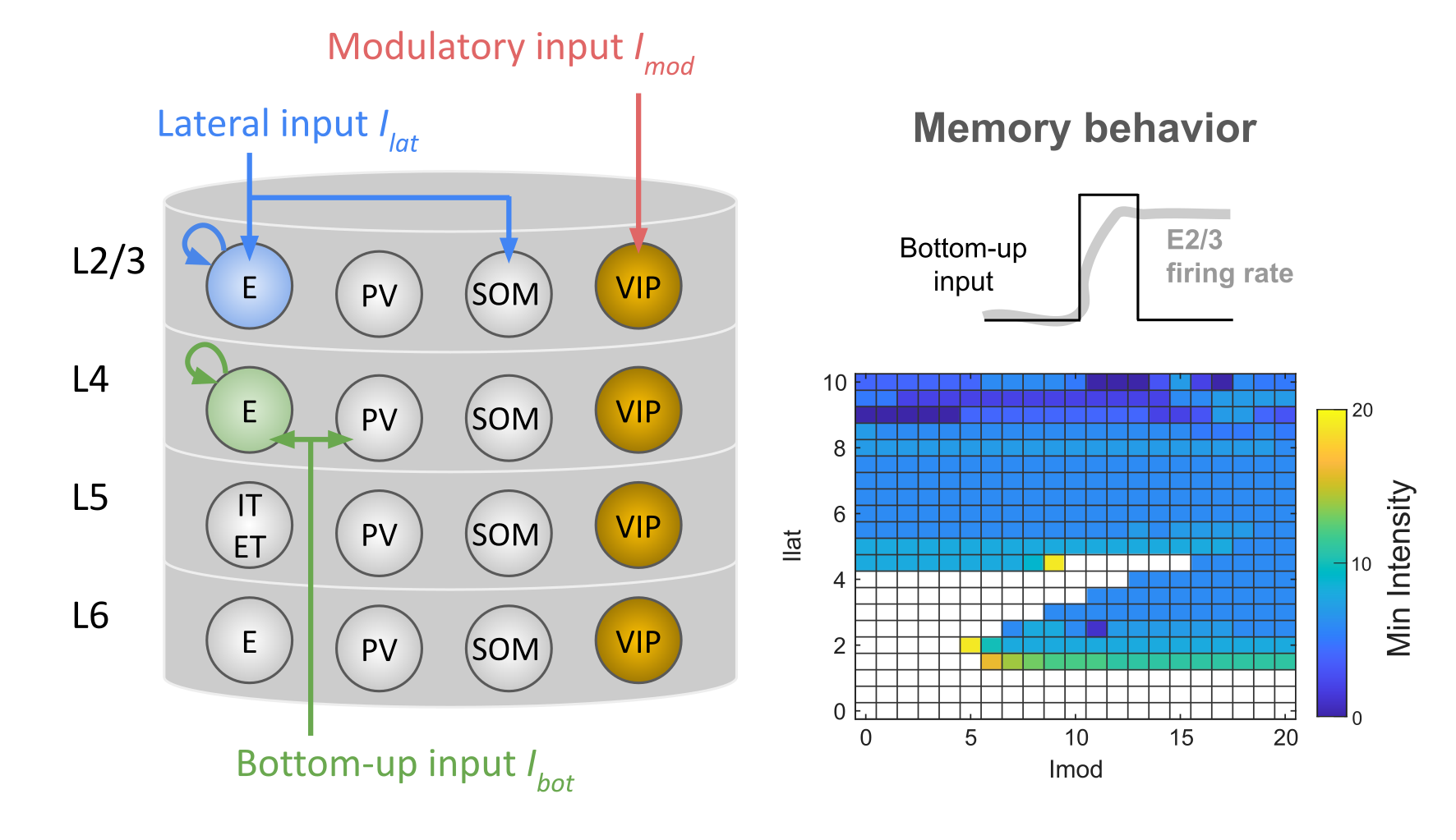 Figure 1. The cortical microcircuit model and its memory behavior. Key model parameters include VIP interneuron cell count (yellow), recurrent connectivity within the E2/3 population (blue), and recurrent connectivity within the E4 population (green). The minimum bottom-up input intensity for a memory behavior varies across different levels of lateral and modulatory inputs.
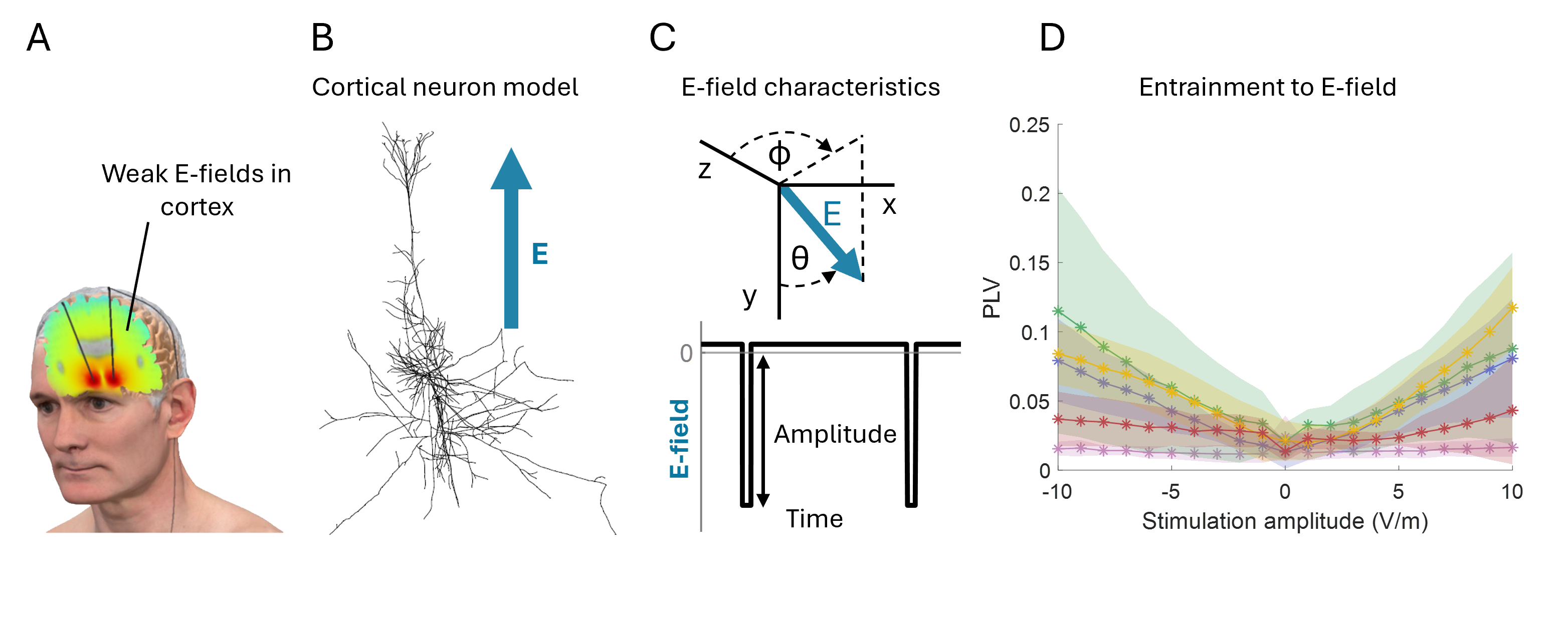 Figure 1. Cortical neuron entrainment by weak electric DBS fields. (A) Illustration of electric fields generated in the brain during DBS. (B) Multi-compartment models of cortical neurons. (C) Electric field orientation relative to the neural morphology. Waveform of the applied field, representing a DBS-like stimulus. (D) Mean phase-locking value increases when amplitude increases.References
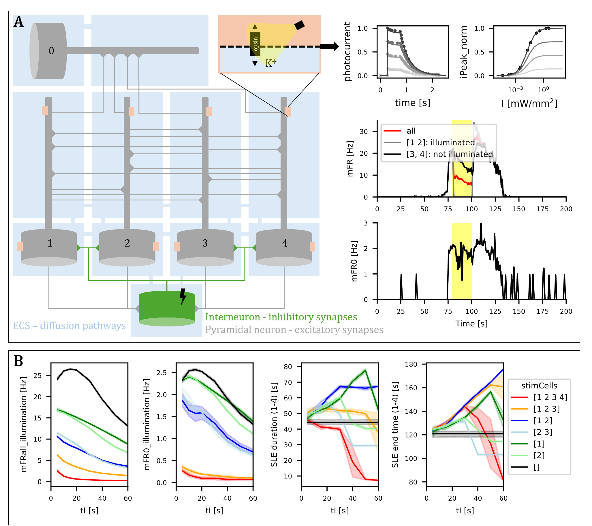 Figure 1. A. Schematic representation of the model and example output. B. Impact of illumination duration (tI) and targeted cell subsets (stimCells) on firing rates during illumination (mFR_all, mFR0) and on SLE duration and end time.
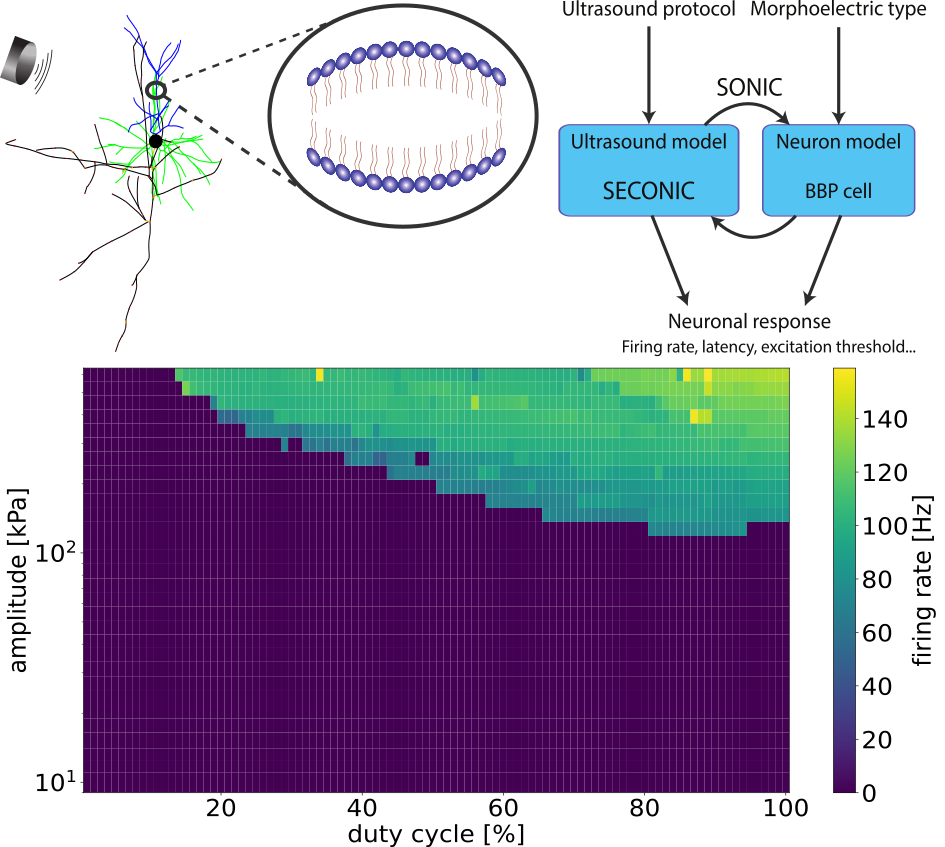 Figure 1. The intramembrane cavitation model in a pyramidal cell (top left), a schematic of the implementation of ultrasound field – neuron coupling (top right) and the firing rate of a L2/3 pyramidal cell as a function of amplitude and duty cycle.
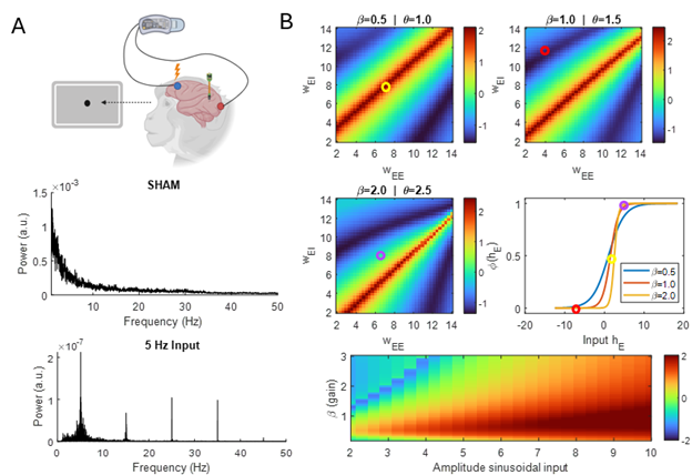 Figure 1. (A) Power spectrum of experimental recordings during SHAM and 5 Hz sinusoidal stimulation. Stimulation induces odd harmonics (15–35 Hz). (B) Log10-OEHR heatmaps from the Wilson–Cowan model showing harmonic dominance across recurrent connectivity (red = odd, dark blue = even). Connectivity sets the net input to the sigmoid transfer function and thus the operating regime (circles).References
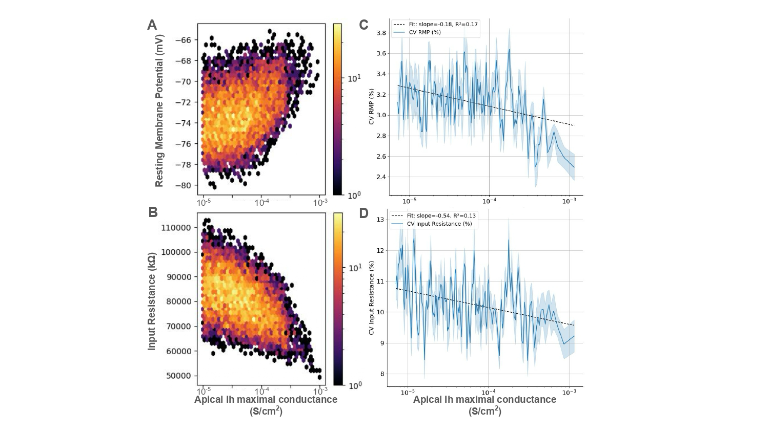 Figure 1. Scatter plot of the (A) resting membrane potential (RMP) and (B) input resistance of a population of ~8000 neurons sorted in increasing order of apical H-current (Ih) maximal conductance, with the coefficient of variation (CV) of RMP (C) and input resistance (D) respectively plotted on the right.
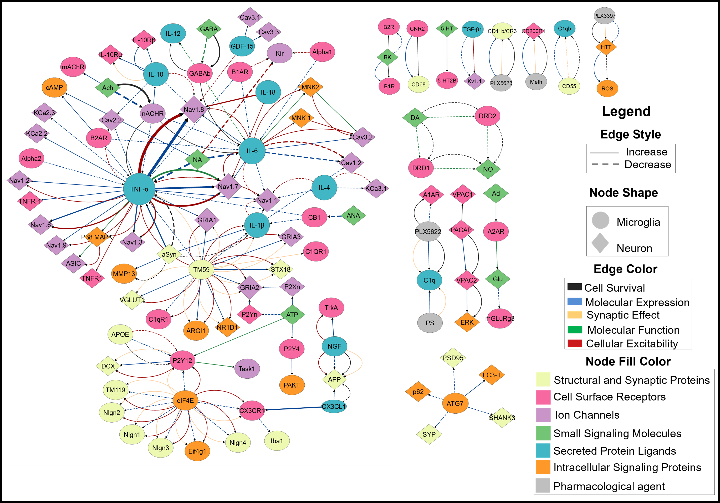 Figure 1. A FINS model of neuroimmune crosstalk. Nodes represent biomolecules, node shape indicates the cell type in which one or more studies reported its localization. The node size corresponds to the number of PRAs in which the node was studied. The node color correspond to the functional category assigned in the nervous system. Edge represents pairwise interaction. Their color shows interaction types, aReferences
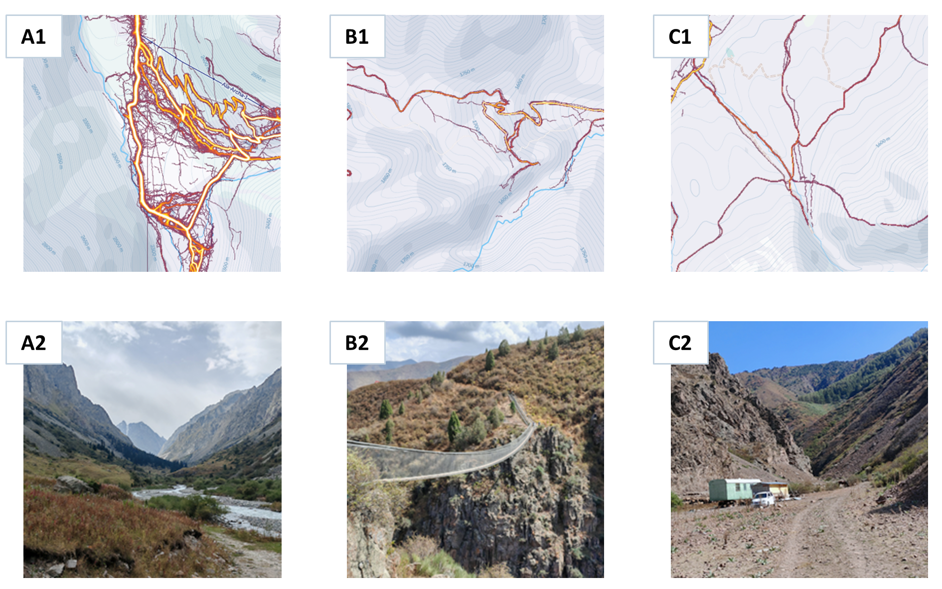 Figure 1. A1, A2: GPS tracks and photo of the location "Ala-Archa" (FM – 1.6 million, attendance 215 people/hour, rating 4.7), B1, B2: GPS tracks and photo of the location "Sky Bridge" (FM – 39.8 thousand, attendance 36 people/hour, rating 4.5). C1, C2: GPS tracks and a photo of the location "Raspberry Gorge" (FM 2.9 thousand, attendance 4 people/hour, rating 4.0).References
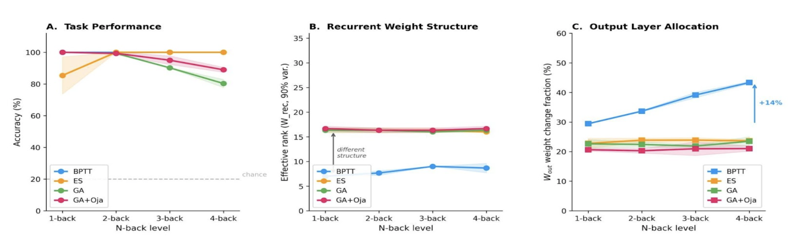 Figure 1. (A) Accuracy vs. n-back level: methods converge at 2-back; ES maintains ~100% at 4-back, whereas GA declines to ~80%. (B) BPTT effective rank increases from ~8 to ~26 with difficulty; evolutionary methods cluster at ~16. (C) BPTT shifts learning to the output layer (+14%); evolutionary methods stay flat. 32 neurons, mean ± std, 3 seeds.